I do graphics and logo design semi-professionally, and I've always been of the opinion that it needs to be fairly basic. The general trick is to start very very basic, so you have a fundamental monochrome design. Then any further adjustments are made to pretty up the original monochrome. That way people see the same symbol in a variety of circumstances.
For instance, suppose Va1entine's next game is a jungle-based one. With a monochrome logo, he can add vines to it and make it fit his game. It's common practice.
Semi-Professionally in the sense that it's a suplementary income. Been doing it on and off for years, I'm not sure how long exactly. It can be pretty lucrative if you do it freelance with next to no overheads, but the work can be hard to find.
Once I managed to earn almost as much from a drawing that took only 3 hrs as I would have earned from an entire day in my accounting job.
Originally Posted by OldManClayton If you offer money, people come a-runnin'.
Oi moocow, people even argue about logo design techniques here. >_< *Slams head against wall*
I'm not doing it for money, I'm just doing it for fun and to help out. Besides, I couldn't do anything with Pounds in the U.S anyways. And really, if he uses any of mine just a mere thanks will suffice.
Once I managed to earn almost as much from a drawing that took only 3 hrs as I would have earned from an entire day in my accounting job.
Oh my yes. It's something that I'd love to fall back on should I fall out with games, used to do design work for a couple of local bars and the supplementary wage became the main one
It was more of a joke, Werewoof. I don't think most people here are doing it for the money... I did it because I love making logos. When I'm bored I make new logos or think up new "company" names. I have about a gajillion.
@Adam: I can quickly edit the logo to make it more readable, not that big of a deal actually.
@Mark: It could have been animated if I had done it in flash or 3dmaya
I did this that logo in a few hours and for free/fun so it's not the best of my designs but I think it can be edited to be included in various genres of games too
I'll try to make another version of the logo later on
EDIT: Here is a new one:
It would suit for a lighter/softer background and the name is "readable".
Ok, did a bonus one for you. It's monochrome (like the ones dines did), so you can change the color or invert the default color to suit your needs. This one is a professional logo (unlike the previous ones I made) so it can be put to use in prints,etc. Normally I would get paid for this, but what the heck
Originally Posted by Mr Green @Adam: I can quickly edit the logo to make it more readable, not that big of a deal actually.
@Mark: It could have been animated if I had done it in flash or 3dmaya
I did this that logo in a few hours and for free/fun so it's not the best of my designs but I think it can be edited to be included in various genres of games too
I'll try to make another version of the logo later on
EDIT: Here is a new one:
It would suit for a lighter/softer background and the name is "readable".
Originally Posted by OldManClayton So... how do you differentiate between professional and non-professional? You liked one better so you decided to call it professional?
My previous logos where not professional logos because they can only be used online and not on anykind of print that easily. I did spend some time on them too but it can't be mobile. While the last one I posted can be ported.
Professional logos mostly follow the general rules set forth by designers and can be made commercial.
These rules are simply:
- A simple logo giving a diverse message (it could be a simple cross like in American Cross, but it gives the message of aid/helping)
- Least amount of colors (for ease in printing and resizing it could be just black and white or about 5 colors the most)
- Vivid image of the logo (despite the size of the complete design, it should be viewable and discreet even on a bussiness card)
Basically if you see a logo design and it shows the whole message of the entreprenuer (might have miss-spelled it)and it's visible , then it's a professional logo design and it's an accurate logo design. Just go to google and image search "game developer logos" to see examples for what I'm saying
Originally Posted by Mr Green @Adam: I can quickly edit the logo to make it more readable, not that big of a deal actually.
@Mark: It could have been animated if I had done it in flash or 3dmaya
I did this that logo in a few hours and for free/fun so it's not the best of my designs but I think it can be edited to be included in various genres of games too
I'll try to make another version of the logo later on
EDIT: Here is a new one:
It would suit for a lighter/softer background and the name is "readable".
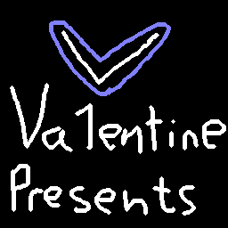
Looks like a woman's tampon variety
LOL, yeah I guess it does look like a tampon variety But still I like the colors

 Advertisement


 .
.


 Besides, I couldn't do anything with Pounds in the U.S anyways. And really, if he uses any of mine just a mere thanks will suffice.


 Edited by Mr G