The Daily Click ::. Downloads ::. Demo ::. Geronimo & The Golden Clock - DEMO
 

Geronimo & The Golden Clock - DEMO
Author: DeadmanDines Submitted: 11th February, 2009 Favourites:0
Genre: Demo Downloads: 267
Rated:


Edited By DeadmanDines on 2/11/2009

So. It's back!

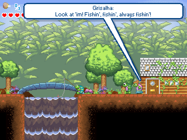
No training level right now, you've already seen that. This is Vila Tartaruga! What will become the first level in the Golden Clock game.

It's not completed by any means, but I feel a little dry, so I thought I'd get some comments!

Key Features
Scripted NPCs, to add a measure of realism. More to come though.
Basic example of the conversation system, nothing special. It's open-ended enough to do whatever I want though, be it a random selection of quotes for each NPC (most common) or a list of quotes which occur in a certain order, or an interaction between 2 NPCs in a kind of cutscene.
Waterfall effect.
Graphics.


Now, stuff I'd like you to look at:

During conversation, I like how you can walk off and keep the text up on the screen. However, do you feel that I should stop that and freeze the player while talking instead?

That's the main focus, but yeah. Please don't find too many bugs, as I want to advance rather than just fixing stuff!

Enjoy!

Review This Download


http://www.4shared.com/file/87218614/e85f8ef0/Geronimo_-_GC_2009-02-11.html (5.7 mkb )


Posted by alastair john jack 12th February, 2009

This is really enjoyable to play. The graphic style is wonderful. I think that conversation system is fine. I wouldn't worry about freezing the player when they talk, as most of the time I get bored of talking to NPCs and would love the idea of being to walk away from them. However you obviously need to make the conversations disappear when you move a certain distance from them.
 
Posted by aphant 12th February, 2009

That speech bubble thing is really cool. It seems a little weird to be able to talk to people one the other side of the village though. Maybe have dialogue cut out when they're 50-100px offscreen?

The "Press enter to speak" prompt seems a little obtrusive. When you have 3 hearts, it looks fine, but after grabbing the 4th one, it starts to look like the bubble (it's shadow mostly) will interfere visually with having more hearts. The level needs more hearts scattered around to test this though. Maybe have some way of getting hurt, to see how empty containers look with that shadow.

Instead of the "Press enter to speak" prompt, how would a "talk to me!" icon look over the NPC's head? It'd be like the bubble, where it only shows up when you're next to the NPC; Having an ever-present icon over your head would probably get annoying.

The first waterfall obscures the HUD when you go down the cliff to the right.

Seems weird to have to jump onto the bridge to cross it. Looks like you walk next to the bridge instead of on it, too.
Comment edited by Adam Phant on 2/12/2009
 
Posted by DeadmanDines 12th February, 2009

Yeah, I struggled with that bridge since when designing the original platform engine I never intended him to walk up diagonal platforms. I may try and alter the design of the bridge so that it shows steps on it rather than just having to trust the user's intuition.

The 'enter to speak' thing is really only done so the user knows to press enter, lol, since this is before the training level. I considered a bubble above the head but figured this could be obscured by gameplay, and it's more of an issue constantly bringing said bubble to the front.

What I'm inclined to do is shrink the bubble horizontally when it's only prompting, and resize it to its natural size during conversation. The way I figure it, it's only really important enough to obscure other HUD elements when you've chosen to speak. Then, as it's an action you've decided to take, it can expand.

Thoughts?
 
Posted by W3R3W00F 12th February, 2009
Rated :

It's very nice! I like the art style and all, but I would recommend maybe making the demo a tad longer and adding some stones to it. Just my two cents.
 
Posted by Ski 12th February, 2009

Hmm it was okay but a couple of things really bugged me:

-Screwed my screen resolution up when I quit the game.
-The waterfall leads to nowhere, which seems kinda lazy IMO.
-The Bridge was annoying, but that's already been mentioned.
-The building graphics were so... unspecial? Nothing about them had any character, nor did they blend in with their surroundings, with bright silvery/white roofs. Perhaps be a tad more imaginative and make them live in tree houses, mud huts or something.

I notice you didn't take my advice on working on the shadows, which is fine, but if you want to suggest a place is bright,sunny and warm then well-pronounced shadows is the way to do it

Also won't be rating this considering it's only yet another Geronimo demo
 
Posted by DeadmanDines 13th February, 2009

Well the resolution is MMF's fault not mine, just add -NOF to the commandline.

Bridge will be sorted, etc.

The shadows weren't added because I can't be bothered. They frankly aren't that big a deal, no one else has mentioned them and if I get that fiddly then I'll just lose interest.

The houses are houses because there are other cultures who will live in tree houses and huts. This is only level one...?
 
Posted by Ski 13th February, 2009

Uh, you can't be bothered to do a job that takes seconds, yet there you are adding flowers, waterfalls, and various characters? And yes, any graphics artist will tell you shadowing is a big deal, whether it's pixel art or not- I thought you were supposed to be an artist?

And if this is only level one, perhaps you should wait a tad longer before the next demo update. I mean, it's perfectly up to you, but don't do a Hempuli and allow us to play or see everything before you even finish it.

Oh, and personally I'd shade the characters so they have more definition, if you're going to be using a lot of green in the backdrops.

http://i202.photobucket.com/albums/aa130/ChrisDines/GezGC2009-02-11-01VilaTartarugaRele.png
Geronimo seems to blend in pretty well with that tree, if it wasn't for his eye and his tummy

Comment edited by -Adam- on 2/13/2009
 
Posted by GamesterXIII 13th February, 2009

Platforms seem ever so slightly strange fading into black.Try fading them into a deep purple rather than black and see if you like it.

Also about the bridge. Slopes should be beyond extremely easy to add since your engine has no decel/accel. If you don't want to add slopes to the engine you could always just add a hotfix on the bridge, but considering the simplicity of adding slopes to an engine like this, that would be pretty uh . . . cheesy.
 
Posted by Assault Andy 13th February, 2009

I think the speech bubbles should disappear when the character goes offscreen.

Clicking 'enter' to talk to the players seems a bit out of the way if the player is naturaly resting on the arrow keys and other controls. Perhaps you could press 'up' to talk? Or attack?
 
Posted by Ski 13th February, 2009

If you're using a PMO you can even just slope the bottom corners of the detector when hes on the ground and he should go up and down slopes with ease.
 
Posted by Klikmaster 13th February, 2009

Dines, try to take these comments as constructive as they will greatly improve the game.

Don't ignore these comments because you aren't bothered and try not to blame faults on MMF, telling someone to use -NOF isn't user-friendly.
 
Posted by RenatoDep 13th February, 2009

Hey Dines, I see you're using portuguese names in the game
 
Posted by DeadmanDines 13th February, 2009

Heehee! Yep, sometimes

Just a couple of points:

a) The screen res bug IS MMF's fault, the only solution is to allow the user to turn it off by default using a secondary screen. I may sort that for the next version.

b) I am taking these comments constructively! It's just that Adam's shadow comment struck a nerve because it appeals to my perfectionism, which is the precise reason why I and those like me never finish games in the first place. I've had to be ruthless with myself and draw a line in terms of detail which I will not cross. The flowers are in and they're fiddly enough to place as it is. Adding shadows to every intersection of every post in a game that doesn't use a grid will be a nightmare, it's just not worth it. There are gonna be some VERY complicated lattices later on. And if I add the shadows on one thing, I have to add them on everything else.

c) The slope thing is actually quite hard to add because of the way I've already coded the collision system. It was simply never intended to handle slopes, so there are loads of areas where slopes should have been accounted for but weren't. However I do have a plan for fixing the bridge, it'll just require a workaround.

The 'UP' button for speach is a very good idea. I may take the time now to start transfering the controls over to an internal INI file with Control X so I can change them more easily later.
 
Posted by Edron 13th February, 2009

i liked this. it isn't top-notch nintendo gba/ds quality, but it's got a nice atmosphere to it. hope it comes out well!
 
Posted by Dynamite 14th February, 2009
Rated :

Hey Dines!

Ok I will share a few of my opinions with the current level:

1. The house roofs didn't look nice, try making them a different colour and a triangular shape
2. The bridge doesn't look like a bridge.

Well keep it up! I hope the rest other levels will be fun!
 
Posted by GamesterXIII 14th February, 2009

Dines I honestly don't really think it would be that difficult to add slopes for the player. Remaking a platform engine of this magnitude should take no more than an hour if that. The basics should be down in 20 min.

Even without remaking I'm sure you could concoct some method for added slopes.
 
Posted by DeadmanDines 16th February, 2009

Trust me, it is . It's not just adding the effect to the player, it's dealing with the effect it has on everything else. It makes a lot of other features much harder to deal with, and runs the risk of some very nightmarish problems with Move Safely when the player's being thrown, bounced, smashed or hurled at high speed.

I'd also have to add slope controls to every NPC in the game, as they have to navigate the world too. It also affects the simplicity of their detectors - you can't trust that an edge detector will work, for instance, if you don't necessarily have basic edges. You'd have charging squirrels screeching to a halt when they come to a gentle downward slope.

I already have in mind a workaround I can use for the bridge.
 
Posted by erghhhhx 16th February, 2009

Apart from the ugly speech bubbles, this is totally amazing...... The world and it's characters feels genuine somehow.

Great job! (but those bubbleeeees.......)
 
Posted by Retired Kliker Lazarus 16th February, 2009

This is incredible. No other words.
 
Posted by DeadmanDines 17th February, 2009

Toxic: What can I do to fix the Bubbles? What is it you don't like about them? I'm about to do some work on them, so I can see what changes I can make.

Also, the bridge workaround is done and works fine. It just tests if his movement will cause him to overlap the bridge and if it does, move him up until it doesn't.
 
Posted by SevenT2 - [GameStormers] 18th February, 2009

Wow, luckily I'm not at the caliber that Dines is at. I'd be getting criticisms left right and center!

I haven't played this yet, but the training level was really really impressive. Keep it up!


Author

Favourite


Advertisement

Worth A Click