Ok, So I pretty much decided to sell my finished book on Lulu.com. Well, that is until I get a publisher or agent. I figure the sales might attract them if they are significant enough. I haven't made the book available to the public yet. First I want to make sure everything is in perfect order. So, first of all, here are three images of the coverart for the book. Keep in mind that:
1. It's a fairly dark book with some themes of horror. It hosts vampires as well as other supernatural entities.
2. It's set in medieval times.
3. Two brothers are the main characters.
4. Each cover is laid out like this: Back Flap - Back Cover - Spline - Front Cover - Front Flap
So tell me which of these coverarts work and which dont. Even if you think all of them are rubbish, feel free to say so. I need the advice. And why. Give critique. Thanks.
This one depicts some of the major characters. My friend tells me that it gives the book a cartoony look and I should not go for that.
So I changed the coverart based on my friend's advice and came up with this. Both the sword and the weird symbols are integral to the book's story.
This is the same as above but in a darker shade, because the book itself is dark.
Also, if anyone wants to give me the downside of using 'Lulu till I get an agent or publisher', please feel welcome to. Also, any sales or marketing tips would be most appreciated.
If I'm being honest I'm not keen on any of those as covers. My fave is the middle one though because it's not too dark and I'm not keen on them portraits on the first cover. I think they're all a bit too cluttered though.
And btw you share the exact name with a chap from my old secondary school, don't know how common a name it is mind!
@ James May - Thanks for being honest. All of them are cluttered or just the portrait? Should I go for a simple black theme? And I dont know. Shahan's fairly common nowadays.
@ Old Man Clayton - Haha, I didnt see what you said. You can leave your comment no matter how harsh it is. I dont mind.
No, it wasn't anything harsh. I was going to ask if the small font was that hard-to-read olde english script as well but enlarged the photo and saw that it wasn't. Looks good! Though I'm not sure if the overly-complicated scroll look it what you want. Just make it less prominent and it will be better. Just a few wrinkles and tears and stuff. Over-the-top design usually doesn't go well on book covers.
@ OldManClayton - Thanks. How about if I remove the sword from the 2nd one and just leave the weird symbols. Or if I leave the sword and remove the weird symbols. That would make it less cluttered and less complicated, right?
@ Adam Phant - It does. Click it and the image should enlarge.
It would look better if you picked one, yes... but I was also talking about the crumbling scroll look-- it's good but the texture is a little too detailed and the color varies quite a bit. I'm no expert, but if it's at all possible to simplify the pattern, I'd try it.
Originally Posted by \/\/olf @ Adam Phant - It does. Click it and the image should enlarge.
Duh. It's hard to read even when it's enlarged. If it weren't for the title of this thread, I'd think the book is titled, "Olo Ltlan'(some sort of squiggly o) Tale: (Capitalized squiggly O)acceo beact." It isn't a clear font. This is not something that can be immediately read. You need to use a better font. Preferably, something that doesn't make the S's look like distorted O's and the R's distinctly different from the C's.
The teaser text on the back is too strong, appearance-wise. The text itself reads like the start of a bad summary that breaks off into something to try and tease the teacher. You shouldn't give away your characters right away, so you should definitely cut out the 3rd and 4th paragraphs. Cut out every direct mention of their father getting murdered and any names that aren't the main characters'. Honestly, if you cut out everything below the 2nd paragraph and removed "the mysterious murder of their father" then it would sound much better. The 1st paragraph needs a rewrite regardless; Supposition makes for a very cheesy tease.
The panel that describes yourself reads like an auto-biography. No one cares about your life story, they only care about your writing credentials. You can cut out the entire first paragraph of it and it would read much better.
Thanks, WereWoof. Your support is most appreciated. So I took Adam Phant's advice as well as everyone else's. I came up with these. I did try to simplify the background but it did not look very good. I'll post the image of that too if you guys want. But anyway, here are the results. I did ask a bunch of people if they could tell what was written (olde English Text) and all of them could understand so that won't be changing.
Both the sword & symbols.
Alternate
Just the sword.
Alternate
Just the Symbol.
Alternate
So, what do you guys think? Better, worse? Comments?
Well, the "simplified" didn't turn out so simplified. I'd say just keep the original brown paper look. (second to last, I think it was) I do like the one with only the symbols and not the sword better. Much less crowded.
The summary seems to be a lot better, but the reference to the Sacred Heart at the end was out of nowhere. You might as well leave it out because we already know as much about it from the title of the book.
I really like the cover with just the symbol, and in its regular form, no alternate. IT looks mysterious, the sword, and the picture of people look silly in my opinion.
@ Matthew Wiese - Thanks. Most people are of the same opinion so thats good
however, it turns out that one of my relatives knows a few publishers. I'm gonna try them first and then, if nothing works out, self publish it as planned. But still, thanks for the all the help
something like that maybe? i think it kind of makes the images stand out a bit more... maybe you could do something with the back part, just subtley...
I can't really say they look that good. You should maybe redesign the cover. The font is a bit hard to read, and the colors blend too much. You should google for professional cover designs of some famous books from the same genre. Cause to be honest, I don't think a publisher might really like that kind of cover (I know cause I was in this biz for a short time).
EDIT: Take a look at these two links and you'll see what I mean
i dont have a problem with the font, heck if i can read my chickenscratch i can read anything. the glass backgrounds look very good actually, the darker colors make them stand out alot more.
and yes i did use the magic wand tool! (also the paintbrush and blur tool to get rid of the little outline, they be my friends)
It's not just about the font. The cover of the book should mainly tell the story right away (similarly to the font). When I looked at your cover and your descriptions of the book, it seems pretty different. That was my main problem. But you make the last choice
Meh i personally think you are trying to convey the whole story on the cover. You dont need anything fancy! You just need a white or maybe black backround with your symbols but on something like a stone or something i dont know, and just leave it as that with the title under it.
Your making it far too complicated with a textured background and textured pictures and funky writing.
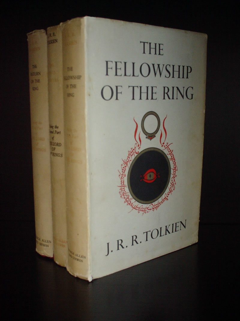
Book covers i mean are like the fellow ship of the ring cover:
See? How its just the title and then the story related picture in the middle. You dont want to out right give away whats in the book on the back either, it looks like youve written alot of info on it on the back when you just want to pull the person into reading it not tell them what happens!
Ok, I did a sample book cover on photoshop to portray what is in my mind. This book cover has nothing to do with your story or cover examples, but it should be informative
Also like Joellie said, you needn't write that much information on the back of the cover. The cover of the book is pretty important, but don't overfill it with lots of images, it will make you look novice. Like I said before, the cover has to somewhat get the attention of your story by a simple portrayal of your story. like on my example cover.
Don't add photoshop textures, gradients and other over-complex stuff
I dunno man, I think the info on the back of the cover is adequate enough. I changed it after Adam pointed out it gave away too much. I dont mention any plot twists, all I mention is two brothers and their quest. There isnt even a mention of what kind of quest and why. I dont know, I might as well leave it blank if I have to shorten it further.
And I do like the image you made. The yellow throws me off though, for some reason I dont like the color. However, if every book is just as bland as you say, what makes people notice my book more? I'd say be funky and bold so people notice the cover. I guess there's two ways at looking at almost anything.
Hmm, if I recall correctly the harry potter covers were quite complex as well, especially the blue Order of The Phoenix cover. Everything was blue. I think it was one of the best covers though. Have a look and tell me what you think about it.
cant even make out the name of the author in this one.
same here on the left one.
What I'm trying to say is dont tell me "a book cover is supposed to be this way because all book covers are this way". Eh, I really dont care about conformity or tradition. What I need is something that will stand out of the all the other books. And sadly, the image you made seems like a very typical suspense/thriller book cover to be honest. What I'm asking is if you're browsing through books in a store, is my cover going to catch your eye? Since its all old parchment style, will it stand out enough for you to pick it up and look at the back?
Well, first of all... there are a few images on this page that did not need to be posted. >_>
Standing out is all well and good--busy is not. The Harry Potter covers had a lot of stuff on them, but they didn't overwhelm your senses. That particular parchment texture has so many varying colors and notches in the edges that it's confusing. There has to be a balance.
If you kinda replicate Mr. Green's little mock-up, and have those symbols in the middle, it would look great.
The parchment and font together look corny, like something someone would do for a school project about pirates or medieval times. I don't know what else to suggest because I know nothing about the story, but the symbols are a good image to use.
I took a shot at a mock-up. This is what I came up with:
Your covers are all lacking your name on the spine. The red box on the spine is where the publisher's logo would go. You also did not make space for the ISBN code on the back cover. This cover is a paperback design, not for a hard cover like yours.
And here are the general guidelines I came up with and used to create the cover:
The red border on the back and front cover is the margin. No text was allowed to overflow into these areas, though the symbol was. The spine is nicely divided, and none of the elements overlap the black glowing edges, allowing the spine content to stay off the front/back covers.
The overall effect I was going for was to make the cover look like a tome. The border has a gilded look to it, the background texture has a leathery look going for it. The title text has a metallic look to it to compliment the gilded border (though the colours do not match as well as I'd like); the metallic look makes text look nice, but some readability was sacrificed to achieve this (the A's are not as crisp as they should be). I also altered the symbol to give it more of a glowing runic look, mostly to stand out from the dark background. The font of the title is Lohengrin, I found it on dafont.com, while all other text is Calibri. The font on the ISBN space is OCR-A Extended.
What I would change about this design is I would move the subtitle text on the front cover down a few points, while I would move the subtitle on the spine up (reader's left) a few points. Also on the spine, I would move the name space down a point or two, as well as shrink the symbol a little bit. The margin on the back cover text is also rather small on the top and left, so that would be increased to give more space between the border and the text and make it easier to read. In regards to the border, it would ideally be slightly (very slightly) more orange, to match the symbol and title better. The title would be desaturated and lightened some so that it's closer to the border colour, too. I'm not entirely fond of how the border looks (the lines I like, the texture behind that I don't), so it'd need some actual brushwork to make it look interesting and less amatuer. The same applies to the background texture, needing actual work instead of using the "render clouds" filter and shrinking it to fit. The symbol on the front cover just looks a mess with the effects and should be redrawn to fit, with the overall colour slightly less saturated. The symbol on the back also needs to be toned down so it doesn't affect the readability of the text, perhaps moved down some. Less text would also be nice, allowing the text and symbol to be mostly exclusive.
I like your basic idea quite a lot. At first I thought wth is this? But when I think of the cover in 3d, actually on a book, it makes much more sense. Seems good but there's a few problems with it. Don't take this the wrong way though, I really do appreciate what you are doing. I'm just stating my opinion. I think the cover seems a bit chaotic. The "Sacred Heart" text and my name for instance, are completely different than the rest. The symbol itself doesnt confrom all too well. I think there's way too many contrasting colors and I'm not feeling a united theme from the cover. But still, thanks a bunch. Gives me ideas.
All it was supposed to do was give you ideas. That's what mock-ups do. And yes, the fonts are different; 28 of 31 books on my bookshelf follow that convention, so there's got to be a reason why they're done that way.
And I appreciate it very much I know they are. I was just saying that both the fonts compliment usually each other and conform with the theme. Look at the harry potter covers, you'll understand what I mean.
Yeah but you dont have to make your cover stand out with colours and textures. And if all you want to say on the back is about two brothers and a quest all you need to write is 'Two brothers...One Quest' or something people cant be bothered to say 'ooh that cover looks simply unique doesnt it?' readers dont want to spend time judging a book by its cover () they want to know in a short sentance what its about and want to get stuck in! When i go to buy a new book i always pick titles that stand out to me, all my books have random covers and i havent even paid attention to the covers in the past, id just stick to simple but work on the art of the letters.
You also spelled it wrong. It's "Heart", not "Hearth." I think it looks nice on the front, but maybe a little lacking on the back. Even a really transparent picture on the back, or a picture of one of the characters would be nice.
I can't believe you guys can make such comments. I just didn't make this up in 2 minutes. I have tens of fantasy books that are using the same technique (gradien) for most of the titles and they have a really good title. And the title font really matches the style of his book. If you can criticize that much, at least give a response for what you can do better, instead of giving a reason to why it doesn't look good or it doesn't match...
I'm not gonna do another help to the forum since everyone is a critic and doesn't appreciate hardwork.
@Wolf: If you would like this cover, I can send the .PSD to you and you can do whatever you like.
@ Joellie - Just three words on the back? You sure?
@ Mr. Green - Haha, I'm sure they can come off as harsh but they mean well, I'm sure. Don't let it bother you. Look how much I've been criticized in this topic. It's all good And yes, I actually do like your cover very much. I think it conveys a dark feeling as well as a medieval feeling. The dark feel was absent from my cover. I wanted to ask whether the fonts you used were freeware or not. Otherwise, I cant really use them. But yeah, send me the psd if you can. You can find my email address on my profile. However, I cant make any promises though, I do like it very much so I'm kinda torn between my cover and yours. I'll give you credit for helping me anyway even if I end up not using it Just tell me what name to use or is Mr. Green okay?
I said earlier I've postponed self publishing until my relative gets back to me, so lets see how that goes. If some publisher does decide to pick my book up, then its not very likely that I'll get to do my own coverart. I'll send him both, mine and yours and he can decide. But thats if it happens.
Anyway, to make a long story short, go to my website - www.oldmanstale.net . It has a sample chapter as well as other information regarding the book. Please, everyone do go there and please sign the petition if you like what you see. Heck, sign it even if you dont What petition? Well, go to the site and you'll find out
It's says "Demo" for the license so I don't know if it's freeware, but you could still ask it's creator for more information or you could also include him in the credits if he agrees
In my opinion you could include the portrays of your characters, inside the book as black and white colored. It would look a lot better. But it's your choice You don't need to give me credit if you don't want to use my cover, but if you do, you can include my name "Gökberk TALU"
I'll send the .PSD to your email right now and also the font file included.
A-haha! We're not criticizing. You've made just as many suggestions for the other covers. I have read many fantasy books myself and I agreed the gradient looks good on other books. But with the combination you have on this particular cover, it just doesn't quite fit. What do you expect us to do, automatically accept you as a book cover genius and not offer our thoughts on it? "Oh wow, that's awesome. I'm lying, but whatever floats your boat."
We aren't being mean. We're trying to be helpful. If you don't want to help in the future, then we'll all be missing out. But I think you've got a skewed view of how you're supposed to get comments on your work.
Oh, also-- If I ever came across as harsh, I apologize. I meant to make my comments in the best of attitudes and don't pretend to be an expert at all. I'm going by my book-buying instinct here--what would make me want to pick your book up off the shelf and read it. The rest of your cover looks good Mr. Green. There's just something about the font... O_o
I'm not saying don't criticize, I'm just saying do a constructive criticizim instead. It's easy to say "it doesn't look good" but instead of just saying that you could point out your opinion and what would make it look better. Recently whenever I do something helpful to other people on the board, all they do is say I don't like this or I don't like that. I just want to know the "why" part so I can improve it to be better...
I didn't have anything to suggest. O_o I agree that if a betterment suggestion is available, it should be used, but you don't have to have a replacement ready to say something doesn't look right.
Can you not be your own critic? Look at the mock-up I put together in 30 minutes. I offered suggestions of how every aspect of it could be changed, what I didn't like about it, and so on. If you can't critique yourself, then what good would critique of others be?
You gradient looks like it was done in less than two minutes. The colour scheme just doesn't fit, particularly the top colour. It's too light, not saturated enough. And the back cover just looks so boring.
I can critique myself when I don't spend any quality time on a mockup like you did before. But the latest one was more than a mockup.
I chose the back cover to be blank because of the most fantasy book cover's I had viewed. In order for me to add something there, it would have to also go well with the front cover and the rest of the style of the book. Everyone says the title isn't good, so what color scheme can fit good? If I make it darker, then it will blend with the background image and won't get the attention. I would have made it darker easily but the book still needs to give attention to the title, unless you don't want to know the title of the book you're reading...
Well, I would suggest a yellowy font, but that might clash with the parchment beneath. :\ The main thing that bugs me is the font itself. I think it's the H in particular. It would probably look better if the font was changed--not necessarily the color.
Mr Greens is a lot more dramatic, with a nicer title typography, although like Phant suggested I wouldnt use a gradient: With a background as bold and dark as that, you may be able to get away witha completely white text? I prefer the thin border on this one, too.
The border on Phant's is too thick IMO, and pretty ugly. The main typography is aligned way too close to the border, too. In all it's a pretty dull and MS word template-like design. I wouldn't buy it.
I've updated the cover, changed the font to a "freeware" one and changed the gradient/color etc to a more better one.
EDIT: Gave the book more of a "published" feeling by adding the Random House publishing logo and changed the info on the back. It was done as an example only, nothing else
Now that's a decent looking cover. Not a fan of the squiggle coming off the r's, though. Also not a fan of the layer styling on the text, but it does look better than the previous rendition. Back cover is still too plain though; You've got plenty of space to add something there. Maybe some fire along the bottom or a pool of blood coming from the side.
@Adam: I can't do anything about the squiggle thingys you mention because they are part of the font I used. I could get rid of them personally but I would have to rasterize them and that would mean less ability to be edited later on. Back cover is really good in my opinion. In order for me to add something there, I would need a high quality and nicely done fantasy art to fill the space. But I think it looks good the way it is
I know how to do that also, but it's the same thing basically. I won't be able to adjust the size and the space of the letters if I do that cause it won't be a font anymore but a shape. I can also do it with a shape but it will be more demanding...
Originally Posted by \/\/olf @ Joellie - Just three words on the back? You sure?
Ive seen lots of books that use this. Some of them merely quote something from the book itself in a short sentance. You want to draw the reader to read your book, you dont want to give them too much or theyl just know the story before actually opening it.
especially if your having inside panels, you should put the blurb on the inside panel at the front and use the back for a short quote from the book.

 Advertisement


 Edited by \/\/olf


 I was going to ask if the small font was that hard-to-read olde english script as well but enlarged the photo and saw that it wasn't.
  Though I'm not sure if the overly-complicated scroll look it what you want. Just make it less prominent and it will be better. Just a few wrinkles and tears and stuff. Over-the-top design usually doesn't go well on book covers.


 In fact, I can read it no prob. Get contacts. And what do you have against his autobiography being said?
 Looks just fine.


 I'd say just keep the original brown paper look. (second to last, I think it was) I do like the one with only the symbols and not the sword better.


 fficial&hs=ria&q=horror%20book%20covers&um=1&ie=UTF-8&sa=N&tab=wi


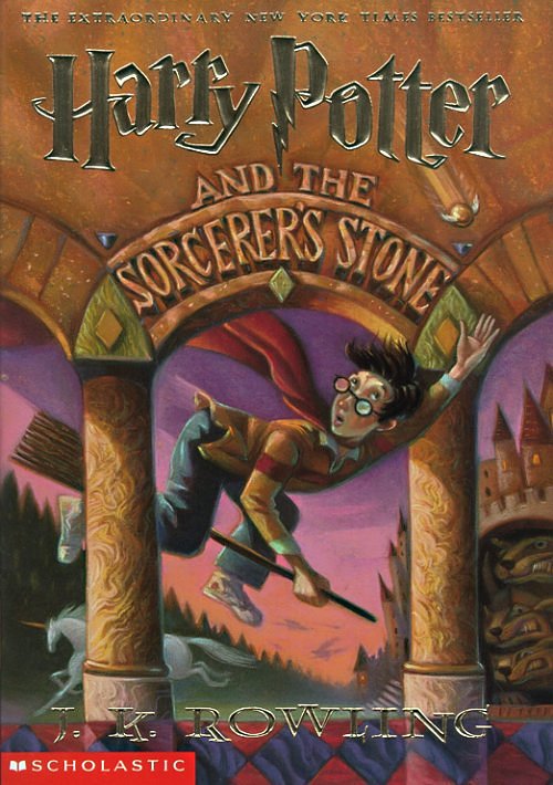
 same here on the left one.