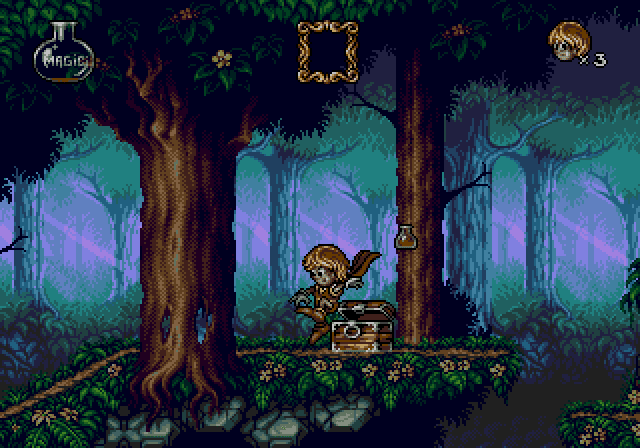
I had to look at a lot of 16 bit games to get a rough idea on how pixel artists solved that problem. There is a forest stage at the start of Castle of illusion on the Megadrive. The foliage is almost entirely dithering which can look a bit scruffy if done badly. An example of nice pixel art is Flink for the Megadrive/ Mega CD/ Amiga 32bit. It looks gorgeous and shows off tiny one colour leaves and much bigger more detailed ones.
I just draw some very rough leaf like shapes then try to make them look less flat by adding some lighter colours to roughly where the curvature of the leaf would be. If it's closer to the camera it's a lighter colour. I hope that makes sense.
I love how they did it with just one colour for the leaves, that's really well done!
Thanks for your tile example there too, I never thought about how small the tile could be! I think I'm going to have a go like inFlink, as you suggested, as a lot of my backgrounds for mountains use just a base colour and then shadow.
A couple more examples of forest scenes by the same guy:
There's a lot you can learn from them, if you look closely.
Firstly, the background is actually a relatively small area that's been tiled horizontally - in Andy's pic, you can see the same trees repeated three times. Doing that should greatly reduce the amount of work for you.
The trees in the foreground are all shaded in basically the same way - as if their trunks are composed of several (slightly knobbly) vertical cylinders bunched together. You can see a lot of pieces being re-used in different places here as well (eg. in the last pic, the smaller of the two foreground trees uses the same clump of foliage top and bottom; in the first pic, the end sections of the branches are all identical, as are the sections where they join the trunk, and various other parts too).
The foreground graphics have a yellowish tint (suggestive of bright sunlight), vivid (highly saturated) colours, and high contrast (which makes it appear closer to the viewer).
The background layers are more blueish (suggesting shadows), and low in saturation, contrast and detail (suggesting distance and ensuring they don't distract the player or make it hard to pick out sprites).
In addition to the transition between layers (distances), there's also a vertical transition in the scene. At the top is a wide band of a single dark colour. This transitions into foliage using just one or two additional shades. As you continue down, the amount of detail, saturation, contrast and colours used, all gradually increase. Look at the second nearest layer of trees - at the top they use just two shades of brown; at their base, the same trees use a couple more shades of brown, plus some extra detail in the form of green moss.
The central section of the screen is always lighter, which gives a sense of distance. Also, by having darker areas at the top and bottom, and a lighter area in the centre, the scene feels far more confined - with the trees being almost silhouetted against the light background, if feels a little misty, and like there's light penetrating into the forest from the distance, while the canopy blocks light from above. Without the dark area at the top, it would feel more light and airy.
Very, very thorough Sketchy! Can't believe I never thought to look at Shantae! By chance, do you know the name of the artist for those screenshots?
Edit: I never thought to say, I'm actually trying to draw treetops - Not the inside, although I will have to draw deep forest backdrop at some point so this is all great. Also I'm trying to work with palm trees, which I can't draw realistically at all.
It's got tonnes of examples, works in progress, and advice from some users to others about how to improve. If you're brave enough, you can try posting your WIP to get critiques. They also have some very nice archived commercial critiques.
Okay, I guess it's time to embarrass myself and show you what I have so far. Here are some trees, they all have various problems:
Currently, I'm using the one on the left. I like the third one along, but it's still looking really awkward. I've been struggling with these for ages. Any advice on actually drawing a simple palm tree for now would be much appreciated.
I don't really have any decent screens to show you, but I hope this gives you an idea of the perspective:
Finally, here is what I mean about the treetops. I should point out that here I've got 2D sprites in a 3D scene:
So yes, the trees especially are seriously lacking. I'm hoping to put all my efforts into this project and I know I can do a lot better than that. I just seem to struggle with scenery.
Edit: Thanks for your link too Alonso! I'll take a look around there.
I think they're too straight and too symmetrical. I don't like the brown outlines either - green leaves should have a green outline (or none at all). They also lack shading - it's better if you can separate the leaves using shading rather than outlines.
I do love your player character though
You've probably seen these, since I just gave you the link, but anyway...
So I've had another go... This time I've taken a different approach to how I'm drawing. Usually, I start with an outline and start to fill in the colours as I go. This time, I've drawn a silhouette with a few different colours.
I'm sort of at the point now where I'm not sure what to do. Should I be adding an outline? I'm dreading adding the shadows and highlights as it always seems so random on leaves.
I think this has much better form, but what do you guys think?
I think that's much better
It kind of depends on the style of your game what you do next. It looks like all your other graphics have outlines, so you probably want to add them just to be consistent. Then you just pick where you want your light source to be, and get shading.
Okay, I've made some more trees. Notice how the left 2 are a bit more rugged, the 3 on the right are more smooth on the leaves. I'm thinking I should go with the smoother look, but I could use the rougher leaves when I'm animating them in a fierce wind.
No outline:
With outline:
Here's an example of how they look in a scene (sorry I can't get a real screenshot right now, the trees here are at 300%, I've no idea what the desert scene is though as it was a screenshot of it in 3D space. It'll be a bit messed up.):
So I've basically mimicked your style Sketchy. Oops. Only mine look more smudgy and your details seem to be placed more strategically. Also you've used better colours. FAR better colours. How do you pick them?
Maybe there are some faults you can spot more easily than I can, other than what I've mentioned? If not, how do you think it fits in with my level graphics? Also let me know if you'd rather me not use a style that is that close to what you did earlier.
They look very nice, and an *immense* improvement over those first pics you posted
I prefer them without the outlines, but only if your other graphics don't have outlines either - maybe keep outlines on foreground objects (character sprites, items that can be interacted with, etc) and lose the outlines on scenery.
Either way, I'd go with the smoother versions - the first two with outlines look a bit messy TBH. I do like them without the outlines, but I just think that the smoother versions are still a better fit in terms of style.
As far as colours go, I just pick a few that look approximately right, and then tweak them later - PaintShopPro has some really good tools for adjusting colour balance. If you're using MMF2's picture editor, that makes colour selection a *lot* more difficult.
Your last mockup image seems to have a limited palette, because the colours are different from the other image (more "muddy" and less vibrant).
Obviously you can use whatever style you like - I would even say they look that similar to the one I did really.
Just a couple more suggestions:
* Use a bit of that darkest brown shade (used on the outlines) to separate the coconuts from the trunk of the trees - at the moment they kind of blend into one another a bit.
* Do something with the bases of the trees, where they meet the ground - I'm not sure what exactly. I know I did the same thing a bit, but there shouldn't be shading under the bottom, because that makes it look rounded, and like it's kind of floating in space rather than going down into the ground.
* Maybe also tweak the curvature of the trunks a bit. The last one is straight but comes out the ground at an angle, which looks a bit odd. The one before has a bit of a kink too. I think the trunk should always come out the ground vertically, and then have a smooth curve (a coconut tree is basically a big heavy weight on the end of a long bendy stick).
Anyway, good job - just goes to show it's worth putting in a little more time and effort, because it really does make a difference
Thanks Sketchy. I'll probably add some grass to the bottom of the trees to help them fit to the ground better. I still think the style is too different to all my other level graphics, but I'm working on fixing that somehow.
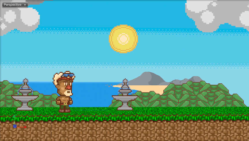
I was wondering if you could take a look at a scene I'm working on here, too.
There are two things that really bug me about it so far. I need some sort of transition between the grass and the hills. The pixel art examples shown above seem to be set out in a different perspective, so I don't feel like I can really use them as examples for this.
I'm going to try and detail the sky a little more later on. Do you think the hills need more detail?
Also, the blossom tree. With the tiny white blossom particles, it looks messy. But without them, it looks like a tree made of bubblegum. Also I think I should be more bold with the colours for the trunk. Any suggestions?
Very nice!
I love the little pagoda and geisha girl
I definitely think you need to add Mt Fuji in the distance though - and perhaps even a sunburst in the sky?
I'm not exactly sure what you mean by a "transition", but you could consider adding another layer for parallax scrolling, in between the background hills and the foreground sprites, and with levels of detail/contrast/saturation somewhere in between as well. I presume you are already using parallax scrolling? (the mountains aren't static and don't scroll at the same rate as the foreground?)
You probably don't want too much detail in the background anyway, because then your sprites become harder to pick out - but you could add detail towards the top of the screen if you wanted to (raise the whole skyline up so you have less sky).
The cherry tree looks alright to me. I'd maybe try a darker and more blueish shade for the trunk and branches (more like the colour of the pagoda roof), and see how that looks. I'd also add a few falling petals in MMF2 - little touches like that are always welcome.
In the pictures of trees, when they're seen at a distance, the bunches of foliage resemble mushroom caps, bending outward away from the branch from which they originate.
I think if you re-think the "origin" of your tree branches, and then orient the foliage around those in a similar way, your trees will look more believable and distinct.
I also have issues with the pink stuff scattered all over it. I agree with Sketchy in that the tree should not contain too much contrast, or else your game ends up with too busy a background.
Thanks guys, both of you - I'm learning a lot as I progress with this game. I appreciate the input!
What I meant by "transition" (probably not the best word) was adding something as a closer background. Like the crops I have in the desert. I think I'll add rocks and possibly a lake to kinda section off the grass and the hills. Oh and I already started on Mt. Fuji!
Lol, wow, the general art quality here has improved a lot since I last checked.
Disclaimer: Any sarcasm in my posts will not be mentioned as that would ruin the purpose. It is assumed that the reader is intelligent enough to tell the difference between what is sarcasm and what is not.
Thanks Muz. I have some pixel art that I actually like in my project, but I can't share it yet. I just need a little direction with certain parts. Trailer soon!

 Advertisement


 Edited by AndyUK


 They also have some very nice archived commercial critiques.