Wicked, thanks for your feedback! I'll stick with the first and clean it up a bit. I'll try that checker board idea to. Can I ask what you think of my into animation (not finished yet)
Well, all mouse controlled aimming games suffer from the 360 degree arm movement, so I won't comment on that.
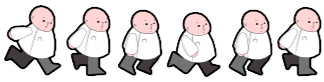
The running animation kinda bothers me, made worse by different color pant legs/boots. If they are both meant to be grey normally, but you made one darker as if it was in the background.. totally black is much too dark. Er.. now that I look at it again the grey leg is in the background and the black leg is in the foreground...
Can you do me a favor and make an animated gif of his running animation?
Originally Posted by tetsuya_shino Well, all mouse controlled aimming games suffer from the 360 degree arm movement, so I won't comment on that.
The running animation kinda bothers me, made worse by different color pant legs/boots. If they are both meant to be grey normally, but you made one darker as if it was in the background.. totally black is much too dark. Er.. now that I look at it again the grey leg is in the background and the black leg is in the foreground...
Can you do me a favor and make an animated gif of his running animation?
Hi, I've never made a gif before but here are the frames (black outline added last night)
The coloring of the legs looks much better now. The black outline is a matter of personal taste. But on your guy, it seems to work.
As for the animation frames, I can see the issue now; you could really stand to have a new frame between the 1st and 2nd frames, as well as between the 4th and 5th. In other orders turn this into a 8 frame animation by added two new frames in those places. The idea is to show a kind of transition between those frames too smooth out the animation. If you can do that, it should be better, if not perfect.
The movement of his head during the running was kinda odd to me. I don't think a person's head should be moving at all while running, honestly. A lot of people try to make their character's head move up and down a pixel or two to try give the impressing the character is walking or running. Everyone knows your height appears to change while walking or running... but it has nothing to do with your head.
Think of a cheerleader doing the spilts. Suddenly the location of her head is much lower then it was before. It's all due to her legs. The basic idea is the the wider you spread your legs, the lower your center of gravity.
So rather then bouncing a head up a few pixels, subtract a few pixels from the legs.
But looking at this again you made the head move back and forth... hmm. Well if you were going for the mega man x style 'turning his head while running' thing.. you actually have to animate his head turning. Just moving his head + and - one pixel doesn't give the same effect. But again, I pesonally feel a character's head shouldn't be moving at all unless you are going for something super cartoonish. Just my two cents.
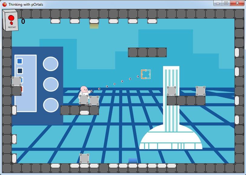
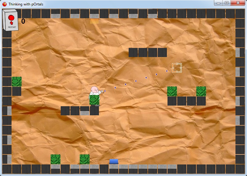
But I do have a problem with the background. It makes no sense. From the original screenshot you posted, I was certain the game was NON-scrolling. The tiled and looping perspective looks very unprofessional, compared to the overall appearance of the rest of your game.
Originally Posted by Chris Burrows I don't mind the running animation.
But I do have a problem with the background. It makes no sense. From the original screenshot you posted, I was certain the game was NON-scrolling. The tiled and looping perspective looks very unprofessional, compared to the overall appearance of the rest of your game.
Hi
No, sorry your right, the actual game is single frame and doesn't scroll, just the intro sequence is scrolling but id absolutely need to fix the prior to it going out anyway.
For anyone else who wants to help, how would you suggest a represent the portal holes? I just can't seem to find a look that I really like?
Originally Posted by Chris Burrows Why is the intro scrolling when the game is not?
It adds a sense of place, drama, reasoning. This is a little flash game so ideally I want to convey the there will be running and jumping. I also want to get the very simple story idea in before the player even presses start so it's setup. For that I need the extra space. Plus it embeds the game within it's own world.
An well I did try when I started out, by allowing the levels to be bigger but I couldn't get it right because:
1) Although I knew where the character was going to come out, the screen jerks too much. So I tried a panning camera which was much better...
2) but...when casual players tried it they had difficulty keeping track of where the player would come out, and it would take them time to track he movement. It sounds really dramatic but honestly it just turned people off.
If t were a full game type thing then I would stick to the panning camera and bigger levels because the types of people who would play would be ok with that.
If I get chance I'll show you what it looks like in a video.
Thanks for replying btw, it's nice to interact with someone on here.
Can I trouble you to think about my concept?
So, ahem....in the intro video you get the portal gun. And then you bump into the titles and two options:
I've never played before, help!
Dude, I totally know what I'm doing!
So if you select the first then there's a little sequence with glados explaining how to shoot and portal jump.
After this, or if you say you know what your doing, glados explains that she wants you dead and before you reach the exit she will randomise the rooms you will play before exiting. She chooses five levels and works out how long it should take to finish. She tells you if you don't make it out then she will blow up the room your in or something to that effect. The the timer starts!
So, why this way? Well it's a flash game so meant it to be quick and have a real pace. It will also tell he player how long is left to try and get them to sit through. Plus, for those wanting to play again or for returning players it's a different challenge each time because quite literally the rooms are randomly chosen from a big list.
No frills, just a good ten minute quick and punchy game, bit of portal jumping and accessible for the majority of people. Stick in some nice cartoony graphics, a simple story and make sure the player can get from loading to playing within a minute without lots of menus.

 Advertisement


 Edited by Pete Devlin