I really like your work, but I feel as if these guys could benefit greatly from smoother, thinner lines, some hue shifting, more saturation, and more contrast.
Also, whats up with the artifacts everywhere? What do you use to draw these?
I really like the designs - the proportions, the stances and everything seem to be spot on. However, there are some areas that need fixing up, as Gamester mentioned, the outlines need re-doing. Did you do these with just a pen tool? It might be an idea to zoom in on your problem areas and redo them pixel-by-pixel. http://www.derekyu.com/?page_id=218 is a good tutorial which could help out.
I get told my lines are to thick and jagged all the time. I do zoom in on the pictures when i create them. I still feel I'm developing my skills a bit.
I'm glad for the feed back from you guys. Most of my designs in the past have been a bit on the odd side. So its good to hear I managed to resist adding weird things to the picture, this time.
The designs are great - but as already mentioned thinning out the lines manually after drawing to 1 pixel wide at all times would make this look a lot better
i still wish to pull off a sort of line weight to the lines. so the lines don't look so flat. I mixed the mid tone color with the outline color to provide some shading to the lines.
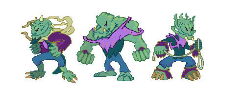
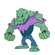
I took the liberty of editing your graphic to get some of the ideas across.
Pic 1 is the original, pic 2 is my update, and pic 3 is my update with a bit of dithering on it (I just did it to see what it looked like basically).
First of all, I cleaned up the lines and made them all one-pixel thick, and deleted any I thought caused problems (I also edited the ring finger to make it look more pointed like the others). And then I picked a new colour, darker than the original outline colour, to bring out the shading a bit more. I noticed while editing that your light source seems a bit iffy on occasion, like on the fingers, the highlight seems to be on the left hand side, but on his arms the highlight in definitely on the right. So I changed this, and also chose a slightly brighter colour as a highlight. And on the fore-arm, I put a lot more shadow on the left hand side and none on the right, to reinforce the light source.
On the third picture, I just dithered the shadow to give a softer feel to the shading. But it doesn't make a dramatic difference.
What's good is that all these things can be learned quite easily until they are second nature. You have the design skills and your characters are drawn right, but they just need finishing up in some areas.
thanks, i really like the results that you got. It's cool that we live in a time, where one can just log on and get such good help.
i think i was coming off week with the light. because i pictured the charactors moving around in low light settings. but they are cartoons and the way you did them fits them so much better.

 Advertisement