The Daily Click ::. Forums ::. Digital Works ::. Theme African Sevannah.
 

Post Reply  Post Oekaki 
 

Posted By Message

Joellie


Registered
  12/11/2008
Points
  210
12th January, 2009 at 23:31:04 -

Lol why would they do that most of them have given critisism!

Heres what i did with it, theres stillroom for improvement so dont be too harsh lol

Image

 
n/a

W3R3W00F

Drum and Bass Fueled Psycho

Registered
  08/11/2008
Points
  370

VIP MemberCardboard BoxThe Cake is a Lie
13th January, 2009 at 01:59:12 -

I love that landscape! It's better than anything I ever drew...

Also, don't listen to that Jonerick guy. He's/ She's just Phizzy in a badly disguised costume. The only reason I can't critisize it is that I know if I compared my drawings to your's, I would have to say my drawings could just go to waste! Although I was proud of a few...

 
n/a

Tomatokid


Registered
  01/12/2008
Points
  188
13th January, 2009 at 03:10:20 -

Wow, great job! Your art is amazing!

 
Will work for pencils and sharpie markers.

Joellie


Registered
  12/11/2008
Points
  210
13th January, 2009 at 08:06:22 -

Thanks guys, i actually dont like the landscape all that much, but itl do! lol

 
n/a

[DELETED]

Likes to put dots on paper

Registered
  08/12/2008
Points
  118

MushroomVIP MemberARGH Sign
13th January, 2009 at 23:40:50 -

Was the background done by hand?

 
n/a

W3R3W00F

Drum and Bass Fueled Psycho

Registered
  08/11/2008
Points
  370

VIP MemberCardboard BoxThe Cake is a Lie
14th January, 2009 at 00:45:41 -

Now that I just realised it, it looks like a photograph! If you were going for that appearance, you nailed it!

 
n/a

Dr. James MD

Addict

Registered
  08/12/2003
Points
  11941

First GOTW AwardSecond GOTW AwardThird GOTW AwardPicture Me This -Round 26- Winner!
14th January, 2009 at 02:13:19 -

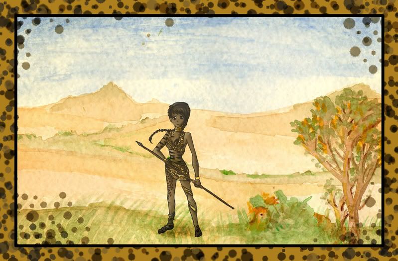
I think it looks much better as a complete composition, the mixture of art styles and colour is a little contrasting I think. And to just echo what others said about the shading, it's a little too smooth I think.


Image
http://uk.youtube.com/watch?v=j--8iXVv2_U
On the sixth day God created Manchester
"You gotta get that sand out your vaj!" x13
www.bossbaddie.com

-J-


Registered
  05/10/2008
Points
  228

VIP MemberThe Cake is a Lie
14th January, 2009 at 10:02:36 -

It kind of looks like she was cut out of a piece of paper and just glued over the top of the landscape. Not saying that this is a bad thing, because it really draws the attention to 'main' part of the picture, and the background is just some artistic icing on the graphical cake.

Lots of old cartoons (and new ones in fact) use a method like this, where the background is just quickly painted or whatever and doesn't match the artistic style of the character. Take Spongebob for example, his colours are very bold and edges quite sharp and defined, but the underwater scenery like the sand and blue background is very smooth and slightly more realistic than himself.

The shadow under her feet helps her blend into the background a bit more, however her right foot doesn't quite seem to 'sit on the ground', almost as if she's standing on her toes. Maybe you could have a few blades of grass going over top of her foot so she seems more "there" if you know what I mean .

The leopard splotches were a really good idea, I think they frame the picture well and honestly it wouldn't be nearly as effective without them.

Edited by -J-

 
n/a ...

Joellie


Registered
  12/11/2008
Points
  210
15th January, 2009 at 20:28:08 -

Well i tried to blend her in by just fading her out a little. I wanted her to stick out more than the background!

I used watercolours for the background and i dont really like it as much.

Meh i did my best lol

 
n/a

Dr. James MD

Addict

Registered
  08/12/2003
Points
  11941

First GOTW AwardSecond GOTW AwardThird GOTW AwardPicture Me This -Round 26- Winner!
16th January, 2009 at 01:40:11 -

Tell ya what though, that background is very ace. Always wanted to pick up watercolours but everything caught on fire so I gave up.

Have you got links to higher res watercolour pics? I like having them as backgrounds since they're always subtle and don't hide out icons

 
Image
http://uk.youtube.com/watch?v=j--8iXVv2_U
On the sixth day God created Manchester
"You gotta get that sand out your vaj!" x13
www.bossbaddie.com

Joellie


Registered
  12/11/2008
Points
  210
16th January, 2009 at 09:05:36 -

No thats my first ever attempt at a watercolour background lol!

Im not a massive fan of it, its the most awkward paint medium ever! lol my lion in the picture is completely botched!

 
n/a

Muz


Registered
  14/02/2002
Points
  6499

VIP MemberI'm on a BoatI am an April FoolHonored Admin Alumnus
17th January, 2009 at 02:27:20 -

Wow, that's nice. The character sticks out a lot from the background, but it's ok. Reminds me of those old 90s adventure games where you know who the characters are and what items to pick up because they stick out from the background.

 
Disclaimer: Any sarcasm in my posts will not be mentioned as that would ruin the purpose. It is assumed that the reader is intelligent enough to tell the difference between what is sarcasm and what is not.

Image

Homemade Games


Registered
  03/02/2009
Points
  18
18th February, 2009 at 15:34:05 -

Nice art! LOL at the lion. I read the whole topic, got to the part where you mentioned that the lion was botched, and thought: "Wait, there was a lion in the picture?" Overall great job. I actually don't like the second one as much as the first, but that's just my personal opinion.

 
-------------

(Insert witty stolen catchphrase here.)

Joellie


Registered
  12/11/2008
Points
  210
18th February, 2009 at 15:58:22 -

Thanks lol yeah the lion was botched i planned to make it way better than it turned out, all the colours jsut mushed up together lol

 
n/a

Mark McCauley


Registered
  18/02/2009
Points
  291

Has Donated, Thank You!VIP Member
18th February, 2009 at 19:41:02 -

Both are very nice

 
http://www.reddwarf.co.uk/forum/messages.cfm?threadid=44227736-C46F-AC56-02EBA05285818C14
   

Post Reply


Advertisement

Worth A Click