The Daily Click ::. Forums ::. Digital Works ::. Some stuff
 

Post Reply  Post Oekaki 
 

Posted By Message

\/\/olf

Creative Genius

Registered
  06/08/2005
Points
  76

VIP Member
22nd September, 2008 at 06:08:03 -

Here's some stuff I've made. C&C welcome.

Image
Image

Takes like 20 seconds to load btw. Be patient.

Image Edited by the Author.

 
Image

www.OldMansTale.net
Sign the Petition! Go go Go!!

Marko

I like you You like you

Registered
  08/05/2008
Points
  2804

Has Donated, Thank You!Game of the Week WinnerVIP Member360 OwnerDos Rules!Happy FellahCrazy EvilI am an April FoolGingerbread House
22nd September, 2008 at 12:39:51 -

My verdict: very niiiiiiiiiiiiiiiiiiiice!!

 
Image

Subliminal Dreams. . ., daily gaming news and the home of Mooneyman Studios!
www.mooneyman-studios.webs.com

Muz


Registered
  14/02/2002
Points
  6499

VIP MemberI'm on a BoatI am an April FoolHonored Admin Alumnus
22nd September, 2008 at 22:23:06 -

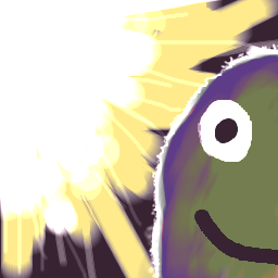
Get rid of the lens flare! Nothing marks a newbie like a lens flare!

They're quite nice, but for one thing, the jagged edges are obvious. Maybe some anti-aliasing? And the lighting seems a bit out of place, I don't know, maybe it looks like different lights are hitting everything on the map.

I do like the shading though, you made all the shapes come out nicely.


Disclaimer: Any sarcasm in my posts will not be mentioned as that would ruin the purpose. It is assumed that the reader is intelligent enough to tell the difference between what is sarcasm and what is not.

Image

\/\/olf

Creative Genius

Registered
  06/08/2005
Points
  76

VIP Member
23rd September, 2008 at 13:35:25 -

Thanks

@ Muz - Ahh, haha. Well I am sorta a newbie I suppose. And the lighting is bad in both of them? By jagged edges, I assume you are talking about the sword. I think the 2nd one has more problems than the first one.

 
Image

www.OldMansTale.net
Sign the Petition! Go go Go!!

\/\/olf

Creative Genius

Registered
  06/08/2005
Points
  76

VIP Member
5th February, 2009 at 07:08:47 -

Image
Kain Somre from my book, Old Man's Tale: Sacred Heart. It isn't published yet but I'm trying

Since I had already started this thread about my art, I figured I'd just put it here. It's a fair attempt I suppose. Anyway, C&C welcome.

 
Image

www.OldMansTale.net
Sign the Petition! Go go Go!!

Mr G


Registered
  31/12/2008
Points
  178

VIP MemberPS3 OwnerI like Aliens!Attention GetterDos Rules!
5th February, 2009 at 08:57:59 -

That would look really nice with some proper lineart and shading

 
Image

http://create-games.com/project.asp?id=1549

Silveraura

God's God

Registered
  08/08/2002
Points
  6747

Game of the Week WinnerKlikCast StarAlien In Training!VIP Member360 OwnerWii OwnerSonic SpeedThe Cake is a LieComputerChristmas Tree!
I am an April Fool
5th February, 2009 at 13:26:43 -

The shapes and such all show promise. I just don't like too much how it seems like your main attempt to finalize it was to blur it all out.

 
http://www.facebook.com/truediamondgame

W3R3W00F

Drum and Bass Fueled Psycho

Registered
  08/11/2008
Points
  370

VIP MemberCardboard BoxThe Cake is a Lie
5th February, 2009 at 15:12:10 -

Very nice, Wolf! It's better than my stuff. Then again, I have a different art style.

 
n/a

\/\/olf

Creative Genius

Registered
  06/08/2005
Points
  76

VIP Member
5th February, 2009 at 23:00:31 -


Originally Posted by BrandonC
The shapes and such all show promise. I just don't like too much how it seems like your main attempt to finalize it was to blur it all out.


Hmm, I kinda get what you mean. Are you referring to the clothing or just the overall look? Heh, I agree it doesn't look as sharp and as vibrant as I had originally planned. I didn't do that on purpose though. Haha, I just dont know any better. Any tutorials you might have on shading and coloring in PS would be most appreciated. Something simple.

I've always wondered, do pros use the burn,dodge,smudge tools or do they just paint with different colors on top of a base color?

And thanks everybody. I do appreciate feedback quite a lot

 
Image

www.OldMansTale.net
Sign the Petition! Go go Go!!

Silveraura

God's God

Registered
  08/08/2002
Points
  6747

Game of the Week WinnerKlikCast StarAlien In Training!VIP Member360 OwnerWii OwnerSonic SpeedThe Cake is a LieComputerChristmas Tree!
I am an April Fool
6th February, 2009 at 04:10:02 -

Well I guess what I'm saying is, I would rather see sharp lines rather then lines that were obviously just blurred out. And like the girls hair in the second picture. I can see where you were going and why you think it looks nice, but really... it just makes my eyes water. I'm not trying to be rude though. All of this artwork looks like it would be great before it was actually shaded. So it's not all bad, I'm just throwing out critique.

 
http://www.facebook.com/truediamondgame

\/\/olf

Creative Genius

Registered
  06/08/2005
Points
  76

VIP Member
6th February, 2009 at 06:39:35 -

Ohhh, I get it, I think. The hair, yeah. I use the burn tool for the hair. That makes it look like its blurred. Haha, no offense taken man. You stop learning the day you cant take critique. I'll try not using the burn tool for shading, lets see how that works out for me. Haha and yeah, I did think it looked good.

 
Image

www.OldMansTale.net
Sign the Petition! Go go Go!!

DeadmanDines

Best Article Writer

Registered
  27/04/2006
Points
  4758
6th February, 2009 at 14:21:07 -

Image

Your black outlines and lack of vividness don't help. If you look above you can see my naff attempt on Oekaki (ignore the colour choice, I'm useless without a colour wheel!). It should at least show how the light picks up on the fur at the edges.

You've done this a little, but it isn't bright enough, and the black outline kind of undoes it again. My best work with lighting to date is in the link below:

http://chris.planetwebsiteservices.com

The background image should show an example of colour and edge lighting.

Also, I tend to choose my colours this way:

1) Find colour of the light.
2) Find the colour of the surface you're drawing (e.g. a blue car).
3) Look at the colour wheel and see where they appear.
4) Find the hue roughly in between the two points.
5) That is the colour you should paint the car.

Edited by DeadmanDines

 
191 / 9999 * 7 + 191 * 7

\/\/olf

Creative Genius

Registered
  06/08/2005
Points
  76

VIP Member
7th February, 2009 at 05:26:19 -

I see, I tried a new one with vivid colors and less black outlines. I'm afraid I'm just no good at shading Is this any better??

Image
Lucas from my book.

Edited by \/\/olf

 
Image

www.OldMansTale.net
Sign the Petition! Go go Go!!

Mr G


Registered
  31/12/2008
Points
  178

VIP MemberPS3 OwnerI like Aliens!Attention GetterDos Rules!
8th February, 2009 at 13:44:58 -

Maybe work on your anatomy and lighting, but it looks good

Also check out this link:
http://www.3datadesign.com/gallery/eng/tutorial_3dlight.php

Edited by Mr G

 
Image

http://create-games.com/project.asp?id=1549

\/\/olf

Creative Genius

Registered
  06/08/2005
Points
  76

VIP Member
9th February, 2009 at 19:21:28 -

Thanks Mr. Green. I haven't had the time to read the article yet but I will definitely do it soon.

Here's another character though.
Image
Anna, from my book.

Edited by \/\/olf

 
Image

www.OldMansTale.net
Sign the Petition! Go go Go!!

Mr G


Registered
  31/12/2008
Points
  178

VIP MemberPS3 OwnerI like Aliens!Attention GetterDos Rules!
10th February, 2009 at 09:31:01 -

Last one is pretty nice and the face looks a lot better. The boobs seem a bit too big (unless you like big boobs )

 
Image

http://create-games.com/project.asp?id=1549

\/\/olf

Creative Genius

Registered
  06/08/2005
Points
  76

VIP Member
10th February, 2009 at 12:06:39 -

You dont??

 
Image

www.OldMansTale.net
Sign the Petition! Go go Go!!

aphant


Registered
  18/05/2008
Points
  1242
10th February, 2009 at 13:30:42 -

You've got quite a uniform style. I can look at any of these pics and recognise that they're all made by the same person.

The most recent one, "Anna," looks the best of all of them, to be quite honest. And no, not because of bewbage . Rather, she looks the best because the lighting makes sense, and it's almost uniform. The only point I can make where it doesn't is in the hair.


\/\/olf

Creative Genius

Registered
  06/08/2005
Points
  76

VIP Member
18th March, 2009 at 04:22:09 -

Image

Here's something I just came up with. Turned out something similar to cel shaded.

 
Image

www.OldMansTale.net
Sign the Petition! Go go Go!!

\/\/olf

Creative Genius

Registered
  06/08/2005
Points
  76

VIP Member
18th March, 2009 at 07:52:20 -

Here's another in the same fashion.
Image

 
Image

www.OldMansTale.net
Sign the Petition! Go go Go!!

\/\/olf

Creative Genius

Registered
  06/08/2005
Points
  76

VIP Member
16th April, 2009 at 02:33:30 -

And another one in my anticipation for the movie and the game. I give you, Wolverine, the most badass comic hero to have appeared in the pages of marvel

Image
"Come on, Bub!"

 
Image

www.OldMansTale.net
Sign the Petition! Go go Go!!

W3R3W00F

Drum and Bass Fueled Psycho

Registered
  08/11/2008
Points
  370

VIP MemberCardboard BoxThe Cake is a Lie
16th April, 2009 at 02:41:15 -

X-men origins: Wolverine ftw!

Lol jk. That's freakin' ace.

 
n/a

Muz


Registered
  14/02/2002
Points
  6499

VIP MemberI'm on a BoatI am an April FoolHonored Admin Alumnus
16th April, 2009 at 05:35:58 -


Disclaimer: Any sarcasm in my posts will not be mentioned as that would ruin the purpose. It is assumed that the reader is intelligent enough to tell the difference between what is sarcasm and what is not.

Image
   

Post Reply


Advertisement

Worth A Click