|
Posted By
|
Message
|

Sephirenn
Possibly Insane 
Registered
15/01/2002
Points
2343
     
|
17th July, 2007 at 20:11:34 -
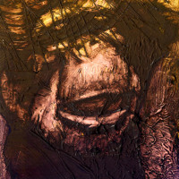
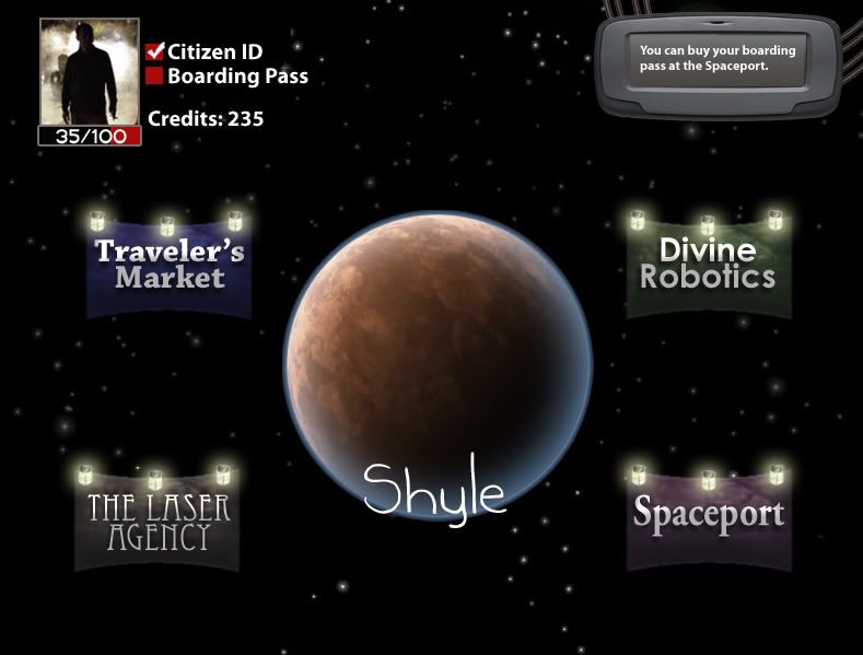
Although the final menu screen will end up looking very similar to this, this is more of a concept shot, as things like the profile picture with change, and details like that:
http://i113.photobucket.com/albums/n238/Sephirenn/aerthy.jpg
Let me know what you think. Better than the last screenshots?
*Sephirenn*
|

waffleton

Registered
20/04/2007
Points
794
|
17th July, 2007 at 23:16:59 -
Well, it looks much much better, i must say that!
But the question is if it suits the in-game graphics. xB
n/a
|

Pixelthief
Dedicated klik scientist
Registered
02/01/2002
Points
3419
     
|
17th July, 2007 at 23:32:02 -
Damn son, that went from maybe a 3/10 to an 8 or 9/10, in presentation.
Gridquest V2.00 is out!!
http://www.create-games.com/download.asp?id=7456
|
waffleton
Registered
20/04/2007
Points
794
|
17th July, 2007 at 23:35:14 -
Yeah, it did. But if it doesnt match the in-game graphics, which im afraid it wont, then it will feel very odd and out-of-place.
n/a
|
Matt Boothman
The Nissan Micra of forum members
Registered
20/09/2002
Points
109
|
18th July, 2007 at 07:16:11 -
Brilliant. No improvements to be made!
http://soundcloud.com/normbo - Listen to my music.
|

Deleted User
|
18th July, 2007 at 07:58:53 -
You intentionally put up a shit screenshot so we'd all be like 'whoa' when you posted the real one.
|

DaVince
This fool just HAD to have a custom rating
Registered
04/09/2004
Points
7998
   
|
18th July, 2007 at 08:06:23 -
Actually, that sounds about right, Phizzy. 
Still, this will certainly do.
Old member (~2004-2007).
|

No
loves Left For Dead 2
Registered
28/12/2006
Points
4000
 
|
22nd July, 2007 at 00:10:36 -
that looks amazingly good
-
|

Zezard

Registered
17/07/2005
Points
326
|
22nd July, 2007 at 14:51:32 -
Looks a bit like a Back Packer game...
Am I right that you are somewhat skilled with PS or alike, even though you are not a pixel artist? Well, then you don't have to care about the pixels, just use some photo source material and PS it to something good.
I don't get the lamps though, they seem a bit out of place to me...
http://create-games.com/project.asp?view=main&id=1217
|

Tim
I'm on here way too much
Registered
25/08/2006
Points
132
   
|
22nd July, 2007 at 15:56:33 -
Yeah I've read that Photoshop tutorial on making planets too, comes in pretty handy 
That 'Shyle' text could do with a bit of touching up - considering its the name of the game..
http://www.SilverNova.co.uk
|

Windybeard Games

Registered
14/04/2005
Points
219

|
22nd July, 2007 at 19:50:16 -
Hmmm i think i agree with phizzy here, but still the new one looks slick! i likeses
n/a
|

Billybobjoe198
Registered
12/01/2007
Points
221
|
22nd July, 2007 at 23:32:37 -
It's bland
n/a
|
Sephirenn
Possibly Insane
Registered
15/01/2002
Points
2343
|
4th August, 2007 at 08:14:15 -
I actually may have to convert to the old screenshot. The reason being that my friend doing the graphics (the PS stuff) is very busy and it seems unlikely he's going to be able to create the graphics for all of the different planets.
In addition, as someone has said, the actual gameplay graphics are not PS, and as such it is almost jarring to switch from a menu screen to gameplay. Being that the whole game is mini-games, that is a damn large amount of graphics to be replacing.
I am unsure how to to proceed from here. Was the original screenshot, once I took out the gradients, that horrible? Can I get away with vector/minimalist graphics when I have the new title screens?
*Sephirenn*
|

The Chris Street
Administrator
Unspeakably Lazy Admin
Registered
14/05/2002
Points
51561
   

|
4th August, 2007 at 16:52:19 -
Go simple. Even default button objects can look good if you know what you're doing.
n/a
|
DaVince
This fool just HAD to have a custom rating
Registered
04/09/2004
Points
7998
|
4th August, 2007 at 19:00:18 -
Compare your menu layout to other (commercial) games, then decide which one fits best for your game. I myself would think that having a few options below eachother would be good, especially if you add a simple effect like a horizontal bar following what option you're picking.
Old member (~2004-2007).
|
|
|
|

 Advertisement

