The Daily Click ::. Forums ::. Digital Works ::. These Graphics and Good?
 

Post Reply  Post Oekaki 
 

Posted By Message

Poobical

Has some jaffa cakes in his coat pocket 3

Registered
  11/27/2008
Points
  404

360 OwnerVIP MemberLOL Sign
22nd June, 2009 at 1:38:28 AM -

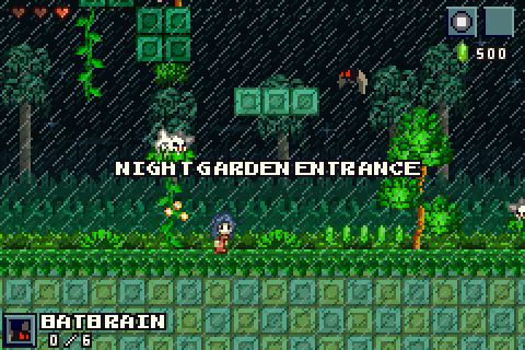
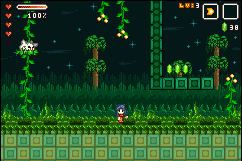
I was bored tonight so I decided to try out some new sprite/graphics styles. Anyway I came up with this:
Do you think it's any good? Cause if you like the style and shiz, then I was thinking to re-do Squeak engine to make it more awesome.
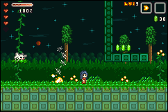
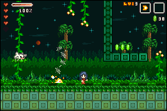
Image
Level: Night Garden

Image
Image
Image

*Theres more to the Standing Animation but its like 50 frames long, so I decided not to put it in *
*Everything is 100% Custom*

I dunno LOL. Hope ya like.

Edited by Poobical

 
Image

Ski

TDC is my stress ball

Registered
  3/13/2005
Points
  10144

GOTW WINNER CUP 1!GOTW WINNER CUP 2!GOTW WINNER CUP 3!KlikCast HelperVIP MemberWii OwnerStrawberryPicture Me This Round 28 Winner!PS3 OwnerI am an April Fool
Candy Cane
22nd June, 2009 at 1:58:40 AM -

What resolution are you running the game at? With a sprite that tiny, Id recommend making the res at least doubled, or give the players the option. The graphics in general are nice, but the trees could use some work to look less lollipop and more organic.

The grass could also do with some work, at the moment it looks quite flat and boring (no offense) Perhaps try to make it look wilder, and overshadowing the blocks making up the ground underneath?

I'd also perhaps suggest using different shades of green. At the moment you've gone for an emerald-looking colour scheme, which might be the look you are going for, but a nice lime/jade green would work wonders on the grass, thrown in with some darker emerald shades for contrast

 
n/a

OMC

What a goofball

Registered
  5/21/2007
Points
  3035

KlikCast Musician! Guy with a HatSomewhat CrazyARGH SignLikes TDCHas Donated, Thank You!Retired Admin
22nd June, 2009 at 2:04:55 AM -

Color tone, like Adamskiploovskaloovska said. Otherwise looks nice!


Poobical

Has some jaffa cakes in his coat pocket 3

Registered
  11/27/2008
Points
  404

360 OwnerVIP MemberLOL Sign
22nd June, 2009 at 2:38:58 AM -

Any better?
Image
Image
Image

(Yeah if I decide to carry on with this, then there will be a x2/Fullscreen option. It's a small screen being I'm trying for GBA resolution)

Thanks for your comments btw

 
Image

jthongbai

Likes to put dots on paper

Registered
  12/8/2008
Points
  143

MushroomVIP MemberARGH Sign
22nd June, 2009 at 2:40:29 AM -

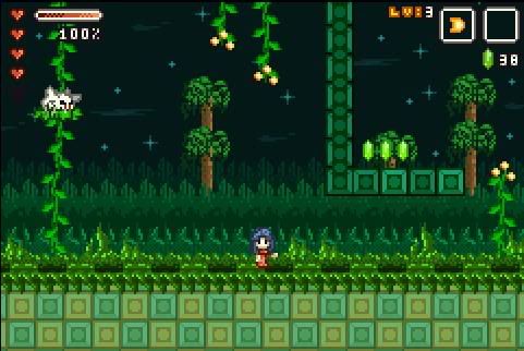
Much better at 2x resolution and the readability is better. No further comments besides what was said, it all looks really great the only thing that could use work is the trees.

 
http://jthongbai.deviantart.com/

Austrian W3R3W00F

Drum and Bass Fueled Psycho

Registered
  11/8/2008
Points
  360

VIP MemberCardboard BoxThe Cake is a Lie
22nd June, 2009 at 4:28:03 AM -

If you're going for the cartoonish style, you're doing great! While I'm trying to find any possible flaws I don't see any so far. This would make a really clean item collecting game.

 
Image
http://www.dogsonacid.com/ DOA, FTW!

Silveraura

God's God

Registered
  8/8/2002
Points
  6744

Game of the Week WinnerKlikCast StarAlien In Training!VIP Member360 OwnerWii OwnerSonic SpeedThe Cake is a LieComputerChristmas Tree!
I am an April Fool
22nd June, 2009 at 5:41:49 AM -

Especially if your backgrounds parallax, these graphics are beautiful. The reason I mention the parallax backgrounds though, two reasons. One, your backgrounds already look layered, so making them move past each other would just have an amazingly comfortable retro feel to them. Also, especially zoomed up, some of the foreground items look like they might blend a bit too easily on a static background. If the background moves around, they'll stand out a lot easier and the game would look even better in motion, than it already does in these very clean stylish graphics. Great job.

 
http://www.facebook.com/truediamondgame

Shiru


Registered
  5/19/2009
Points
  253
22nd June, 2009 at 10:44:48 AM -

Nice nice. 2x view is better. How much time have you spent on it ?

 
Final Legacy's main creator.
http://www.create-games.com/project.asp?view=main&id=1583

Dr. James MD

Addict

Registered
  12/8/2003
Points
  11952

First GOTW AwardSecond GOTW AwardThird GOTW AwardPicture Me This -Round 26- Winner!
22nd June, 2009 at 12:03:55 PM -

First off never use JPEG for pixel art, it's hard to judge how the 2x picture looks becuase of JPEG artifacts. Other than that it looks purdy nice, just be sure to give us controller and fullscreen support

 
Image
http://uk.youtube.com/watch?v=j--8iXVv2_U
On the sixth day God created Manchester
"You gotta get that sand out your vaj!" x13
www.bossbaddie.com

Mkingy


Registered
  7/5/2003
Points
  4772

Box Blue
22nd June, 2009 at 12:15:53 PM -

Yeah save it as .png so you don't lose the quality

Looks pretty good to me

 
n/a

Poobical

Has some jaffa cakes in his coat pocket 3

Registered
  11/27/2008
Points
  404

360 OwnerVIP MemberLOL Sign
22nd June, 2009 at 4:36:06 PM -

@Brandon: Yeah if I do decide to make a game out of it, it shall have parallax backgrounds.

@Sire: Roughly I would say about a hour, hour 'n' half.

@James: Accidently saved it as a jpeg, but when I came to edit it, someone already posted. 'Ere's a non jpeg version:
Image

Oh and some more animations just for the lolz

Image - Standing 2
Image - Zombie
Image - Getting Hit (Or Backwards Moshing...)
Image - Death!

Thanks for your comments guys, been really helpful
(Edit: I have started a engine for this, it actually is the best engine I've made so far. (Better than Poob's) I might make something out of it, I'll upload a level or something soon to get ya opinions)

Edited by Poobical

 
Image

Dr. James MD

Addict

Registered
  12/8/2003
Points
  11952

First GOTW AwardSecond GOTW AwardThird GOTW AwardPicture Me This -Round 26- Winner!
22nd June, 2009 at 4:42:57 PM -

Bootful! Looks a lot better

 
Image
http://uk.youtube.com/watch?v=j--8iXVv2_U
On the sixth day God created Manchester
"You gotta get that sand out your vaj!" x13
www.bossbaddie.com

Ski

TDC is my stress ball

Registered
  3/13/2005
Points
  10144

GOTW WINNER CUP 1!GOTW WINNER CUP 2!GOTW WINNER CUP 3!KlikCast HelperVIP MemberWii OwnerStrawberryPicture Me This Round 28 Winner!PS3 OwnerI am an April Fool
Candy Cane
22nd June, 2009 at 4:49:48 PM -

I'd still add a shadow where the grass overlaps the ground blocks.

 
n/a

Marko

I like you You like you

Registered
  5/8/2008
Points
  2797

Has Donated, Thank You!Game of the Week WinnerVIP Member360 OwnerDos Rules!Happy FellahCrazy EvilI am an April FoolGingerbread House
22nd June, 2009 at 5:20:54 PM -

Wow - i like it all, especially as the concentration of green really makes all the fauna stand out. If i would make one change though it would be the grass the player is stood on - looks too triangularly (?!) to me and not organic enough. Love it all the same though

 
Image

Subliminal Dreams. . ., daily gaming news and the home of Mooneyman Studios!
www.mooneyman-studios.webs.com

Shiru


Registered
  5/19/2009
Points
  253
23rd June, 2009 at 1:27:23 PM -

Nice. I love the "zombie" pose .

 
Final Legacy's main creator.
http://www.create-games.com/project.asp?view=main&id=1583

Yami


Registered
  12/23/2003
Points
  607
23rd June, 2009 at 3:14:20 PM -

There needs to be more contrast between the background and the foreground in order to add more depth, because at this point it could easily be seen as flat.


A simple solution would be to just add highlights on the foreground to make them pop out more.

 
Image

Farmer


Registered
  8/4/2008
Points
  17
23rd June, 2009 at 10:22:52 PM -

I agree with Yami that there needs to be a little more depth, although the depth may be more apparent with parallax scrolling. Otherwise, loving it

 
http://jamesctplant.wordpress.com

Poobical

Has some jaffa cakes in his coat pocket 3

Registered
  11/27/2008
Points
  404

360 OwnerVIP MemberLOL Sign
25th June, 2009 at 3:06:34 AM -

Thanks for your comments. With the issue of depth, I've changed the background colour scheme to more dark blue, and make it more blue as it fades into the distance. Looks more better with parallax, but I can't really show that in a picture sadly. I've also changed the hud, looks more arcade/console like now me thinks.

Image
Image

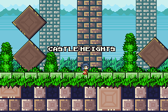
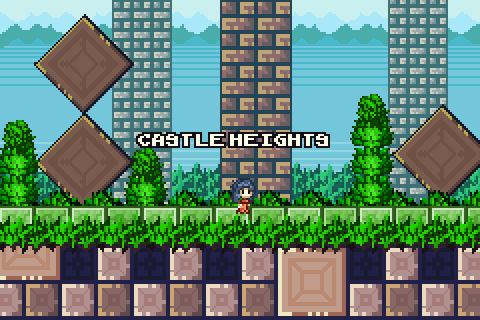
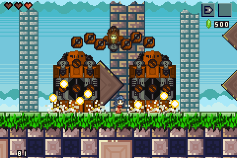
This is something I've been working on, Castle Heights. This is the starting place for the adventure. I've took some influence from Super Mario World 2 for this one to be honest. It still needs some work, but the general concept is there.

Image
Image

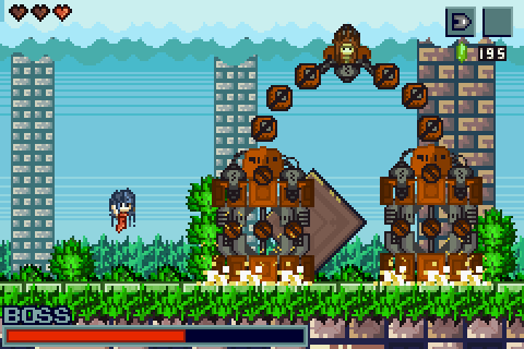
And this is the first boss, "Stomp". As you can see it's a Mech, which really shouldn't fit in a fairytale world...but thats a part of the story...
Still needs some work, mainly in shading and some extra bit's and bobs but the base is there. (Allows me to program the boss code in)

Image
Image

What ya think of these? Any good? I really appreciate your comments, it's helping me become a better pixel artist and kilker

 
Image

Ski

TDC is my stress ball

Registered
  3/13/2005
Points
  10144

GOTW WINNER CUP 1!GOTW WINNER CUP 2!GOTW WINNER CUP 3!KlikCast HelperVIP MemberWii OwnerStrawberryPicture Me This Round 28 Winner!PS3 OwnerI am an April Fool
Candy Cane
25th June, 2009 at 3:08:44 AM -

Oh wow, that's really looking great

 
n/a

Dr. James MD

Addict

Registered
  12/8/2003
Points
  11952

First GOTW AwardSecond GOTW AwardThird GOTW AwardPicture Me This -Round 26- Winner!
25th June, 2009 at 3:17:15 AM -

Doubled they look great, but they're quite hard to see in the original resolution. There's too much definition between the fore and background, and a lot of contrast too. Kinda reminds me of Sonic like that. But it looks good stuff. I just think that background graphics should be less defined.

 
Image
http://uk.youtube.com/watch?v=j--8iXVv2_U
On the sixth day God created Manchester
"You gotta get that sand out your vaj!" x13
www.bossbaddie.com

Poobical

Has some jaffa cakes in his coat pocket 3

Registered
  11/27/2008
Points
  404

360 OwnerVIP MemberLOL Sign
25th June, 2009 at 3:22:02 AM -

Cheers Adam 'n' James. So you think that I should just make the game window itself doubled, and give the player the option to resize to original state or full screen. See I agree, with it looking really nice at double, but a bit hard to see at normal size.

Mmm. Even though I'm building this in TGF, I'm just thankful MMF has the window control extension. And for the first time, when I ported it over, no bugs happened at all.

 
Image

Ski

TDC is my stress ball

Registered
  3/13/2005
Points
  10144

GOTW WINNER CUP 1!GOTW WINNER CUP 2!GOTW WINNER CUP 3!KlikCast HelperVIP MemberWii OwnerStrawberryPicture Me This Round 28 Winner!PS3 OwnerI am an April Fool
Candy Cane
25th June, 2009 at 3:25:37 AM -

Yes, give players an option for screen size. People have different preferences with this kinda thing.

 
n/a

OMC

What a goofball

Registered
  5/21/2007
Points
  3035

KlikCast Musician! Guy with a HatSomewhat CrazyARGH SignLikes TDCHas Donated, Thank You!Retired Admin
25th June, 2009 at 3:27:18 AM -

Even in doubled mode that last one is too chaotic.


Ski

TDC is my stress ball

Registered
  3/13/2005
Points
  10144

GOTW WINNER CUP 1!GOTW WINNER CUP 2!GOTW WINNER CUP 3!KlikCast HelperVIP MemberWii OwnerStrawberryPicture Me This Round 28 Winner!PS3 OwnerI am an April Fool
Candy Cane
25th June, 2009 at 3:35:43 AM -

I don't think it would look too "chaotic" if you put colour behind the gaps in the boss, a darker brown or black. Help it stand out a little more.

 
n/a

Poobical

Has some jaffa cakes in his coat pocket 3

Registered
  11/27/2008
Points
  404

360 OwnerVIP MemberLOL Sign
25th June, 2009 at 3:58:13 AM -

How about this? Less chaotic?

Image
Image

Ignore the 81. I forgot to move the Boss counter into the screen. >.<

Edited by Poobical

 
Image

Austrian W3R3W00F

Drum and Bass Fueled Psycho

Registered
  11/8/2008
Points
  360

VIP MemberCardboard BoxThe Cake is a Lie
25th June, 2009 at 4:08:11 AM -

Oooh, Awesome as always. The contrast from the foreground, middleground, and background are good, but I think the grey pillars in the middleground should be a tad darker.

 
Image
http://www.dogsonacid.com/ DOA, FTW!

Klayman


Registered
  8/10/2002
Points
  138

MushroomVIP MemberI am an April Fool
4th July, 2009 at 3:07:10 PM -

Wow, just browsed through these screen shots. They look great and I'd love to see this game be made. Good work.

 
Klayman (AKA Steve)
I also make t-shirts: http://www.robitstudios.com/

herooftime1000


Registered
  1/9/2009
Points
  209
22nd July, 2009 at 11:59:47 PM -

I really like the walking and falling animations! The color scheme is great, too!

 
n/a

Silveraura

God's God

Registered
  8/8/2002
Points
  6744

Game of the Week WinnerKlikCast StarAlien In Training!VIP Member360 OwnerWii OwnerSonic SpeedThe Cake is a LieComputerChristmas Tree!
I am an April Fool
23rd July, 2009 at 1:03:20 AM -

Wow, these graphics are very impressive. It's awesome to see how constructive criticism is gradually improving this style every time you thought it couldn't be improved.

 
http://www.facebook.com/truediamondgame
   

Post Reply


Advertisement

Worth A Click