The Daily Click ::. Forums ::. Digital Works ::. Screenshot... too newb???
 

Post Reply  Post Oekaki 
 

Posted By Message

Sephirenn

Possibly Insane

Registered
  1/15/2002
Points
  2344

360 OwnerPS3 OwnerWii OwnerI am an April FoolVIP MemberGOTW JUNE 2010 WINNER!
8th July, 2007 at 9:02:52 PM -

I can't decide if I like my 'menu' screen for the first world of my new game. I have posted a link to the screenshot below:

http://i113.photobucket.com/albums/n238/Sephirenn/Shyle.jpg

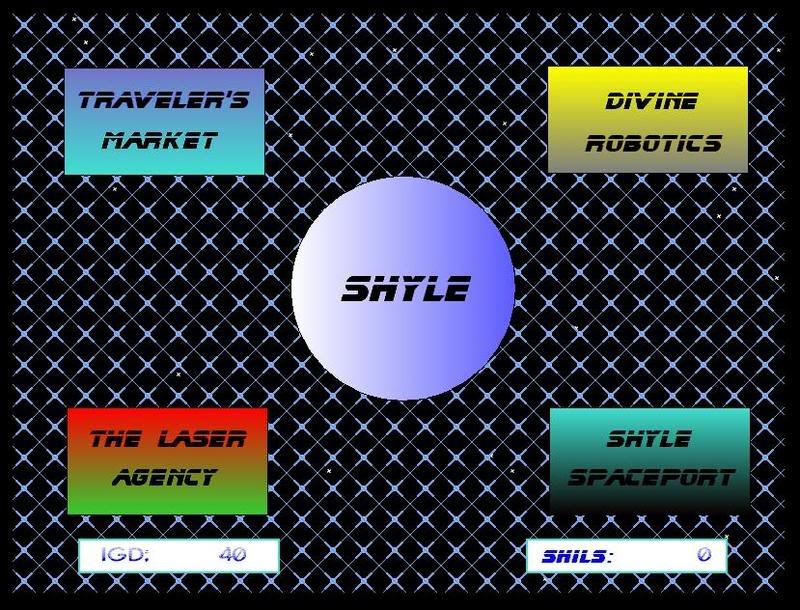
The four "boxes" vibrate when you mouse-over them, and the stars in the background paralax. The 'theme' of this place is that you're in an old spacestation.

Please give me some feedback if you're feeling so kind. Thanks!!

 
*Sephirenn*

Dr. James MD

Addict

Registered
  12/8/2003
Points
  11952

First GOTW AwardSecond GOTW AwardThird GOTW AwardPicture Me This -Round 26- Winner!
8th July, 2007 at 9:13:40 PM -

Less of the gradients I say. Maybe something to make it look more abandon-y

 
Image
http://uk.youtube.com/watch?v=j--8iXVv2_U
On the sixth day God created Manchester
"You gotta get that sand out your vaj!" x13
www.bossbaddie.com

waffleton


Registered
  4/20/2007
Points
  794
8th July, 2007 at 9:20:34 PM -

The background hurts a bit too look at, and you really shouldnt use gradient fills for the buttons.
But it doesnt look all that bad though, keep up the good work x)

 
n/a

DaVince

This fool just HAD to have a custom rating

Registered
  9/4/2004
Points
  8001

Game of the Week WinnerClickzine StaffHas Donated, Thank You!Cardboard BoxDos Rules!
9th July, 2007 at 7:00:33 AM -

The background contrasts too much with the rest, take some colours that are very close to eachother to make up the background. Avoid gradients, they are "professional" (as in some people THINK they are professional, but they really just suck, especially when using the wrong colour combinations like red+green).

 
http://davince.tengudev.com/
Still a member of Ectoprods! If it still exists, that is.

Don't take me for a FOOL!

"you purple nurple " - Del Duio

Sephirenn

Possibly Insane

Registered
  1/15/2002
Points
  2344

360 OwnerPS3 OwnerWii OwnerI am an April FoolVIP MemberGOTW JUNE 2010 WINNER!
9th July, 2007 at 8:23:53 PM -

sweet, thank you kind sirs. I will make some changes and take your professional opinions into account!

 
*Sephirenn*

Sephirenn

Possibly Insane

Registered
  1/15/2002
Points
  2344

360 OwnerPS3 OwnerWii OwnerI am an April FoolVIP MemberGOTW JUNE 2010 WINNER!
14th July, 2007 at 1:12:53 PM -

This is the updates screenshot:

http://i113.photobucket.com/albums/n238/Sephirenn/Shyle2.jpg

I think its better. Should I get rid of the gradient on the planet though?

 
*Sephirenn*

Willy C


Registered
  2/14/2004
Points
  1323

Game of the Week WinnerKlikCast StarPicture Me This -Round8- Winner!VIP MemberWii OwnerIt's-a me, Mario!Hero of TimeThe Cake is a LiePS3 OwnerI am an April Fool
Batman!Teddy Bear
14th July, 2007 at 1:59:53 PM -

Looks alright. Try putting something something behind the fence

 
http://www.robocaptain.com

The Chris Street

Administrator
Unspeakably Lazy Admin

Registered
  5/14/2002
Points
  15321

Game of the Week WinnerClickzine StaffAcoders MemberKlikCast StarVIP MemberPicture Me This Round 35 Winner!Second GOTW AwardYou've Been Circy'd!Picture Me This Round 38 Winner!GOTM December Third Place!!
I am an April FoolKliktober Special Award Tag
14th July, 2007 at 2:08:18 PM -

Not sure if I like the font on that. Also, it needs some stuff... a more interesting background... maybe some particle effects or something?

 
London 2012 - Promotional Video
http://www.youtube.com/watch?v=W7CkIrx9mXY

http://www.acoders.com
http://www.youtube.com/tehowchies
http://twitter.com/thechrisstreet

Image

Peblo

Custom ratings must be 50 characters or less

Registered
  7/5/2002
Points
  184

Game of the Week WinnerVIP MemberI'm on a Boat360 OwnerAttention GetterThe Cake is a LieCardboard BoxHero of TimePS3 OwnerIt's-a me, Mario!
I'm a Storm TrooperSonic SpeedStrawberryI like Aliens!Wii OwnerMushroomGhostbuster!
14th July, 2007 at 2:14:36 PM -

Make the grating scroll across another grating scrolling in the opposite direction.

 
"Isn't it always amazing how we characterize a person's intelligence by how closely their thinking matches ours?"
~Belgarath

Matt Boothman

The Nissan Micra of forum members

Registered
  9/20/2002
Points
  33

Game of the Week Winner
14th July, 2007 at 3:09:49 PM -

Less is more. Get rid of the boxes, and the background and just have words on a blank field. It will look much more professional (as in actually professional, not "professional".)

If you're mad keen on the boxes, make them one colour with maybe just an outline. Also, I'd use a more standard font, as ones such as that tend to look dated as soon as they are made because they are designed to look "futuristic".

 
http://soundcloud.com/normbo - Listen to my music.

AndyUK

Mascot Maniac

Registered
  8/1/2002
Points
  14165

Game of the Week WinnerSecond GOTW AwardHas Donated, Thank You!VIP Member
14th July, 2007 at 5:16:33 PM -

you could draw some pipes to border the whole screen or the boxes, or both.

 
.

Sketchy

Cornwall UK

Registered
  11/6/2004
Points
  2481

VIP Member
14th July, 2007 at 9:23:31 PM -

No offense, but I don't like either. Depends how good the rest of the game looks/plays though.

I'd generally avoid really bright primary colours, gradients, and huge simple shapes. Kind of hurts the eyes. Same with the background for that matter - obviously tiled backgrounds are ugly. It's certainly not making me feel like I'm in an old spacestation either.

I don't think you should be using the same font everywhere. The way I see it, the four options all represent companies, and each should have its own unique logo. Think of the "Travelers Market" as the equivalent of Tescos, "Divine Robotics" as Ford, and "Shyle Spaceport" as American Airlines - those companies don't just use the same logo but in different colors do they? Think about how professionals design company logos - they don't just want something that looks cool - it has to "feel" right - I'm sure there's plenty of information online. I'd also do something about the planet(?). Have a few different ones if any at all, and make them look like planets (atmosphere, craters, land/sea etc) - download some planet photos if need be.

Personally, I'd be practicing my pixel art skills, and have an isometric scene of the spacestation. You'd be able to see your ship parked in the spaceport and you'd maybe have to walk your character to the different places (or you'd at least see him walk to the option you select). Maybe add a few NPCs you could talk to - they might give you tips, might further the storyline, or might just give background information about the universe in which the game is set, making the player feel more immersed.

This is obviously a *lot* more work, but provided the rest of the game is well presented, it will be worth it. Otherwise, I honestly think just a column of decent buttons (not the crappy system buttons) on a relativly plain, dark background will look *much* better. Go to flashbuttons.com or similar if you want some decent looking buttons without putting much effort in.

Just my opinion. Take it or leave it.

 
n/a

Hempuli

Crazy?

Registered
  1/9/2005
Points
  7969

Game of the Week WinnerGOTM JULY - 2009 - 2ND PLACE!GOTM AUGUST- 2009 - 2ND PLACE!GOTM OCTOBER 2009 - WINNERI am an April FoolGame of the Week Winner - MARCH 2010!-
15th July, 2007 at 4:05:54 AM -

I think you should think some kinda color & graphic style that you use in every menu in the game. It makes the game look better. Like in that screenshot the buttons are different sizes & shapes, and all of them have different colour gradients.

 
No sig for you.

Sephirenn

Possibly Insane

Registered
  1/15/2002
Points
  2344

360 OwnerPS3 OwnerWii OwnerI am an April FoolVIP MemberGOTW JUNE 2010 WINNER!
15th July, 2007 at 5:52:26 PM -

Thanks guys, I will deffinitely take everything you've posted into consideration. Having said that, I am going to try and upload a few frames of my game so that you guys can see it actually animated, so that you'll have better perspective. Although it won't change a lot of the comments, I feel that it will cancel out some of them.

And I'd just like to restate that I am a horrible pixel artist, which is why I went with the box signs. Also, most of the gameplay (non-menu's) is made with stuff that is easy to draw (vector-ish). Hopefully I can pull people in with the gameplay/originality/story of it, instead of the graphics.

Image Edited by the Author.

 
*Sephirenn*

Sephirenn

Possibly Insane

Registered
  1/15/2002
Points
  2344

360 OwnerPS3 OwnerWii OwnerI am an April FoolVIP MemberGOTW JUNE 2010 WINNER!
17th July, 2007 at 11:35:04 AM -

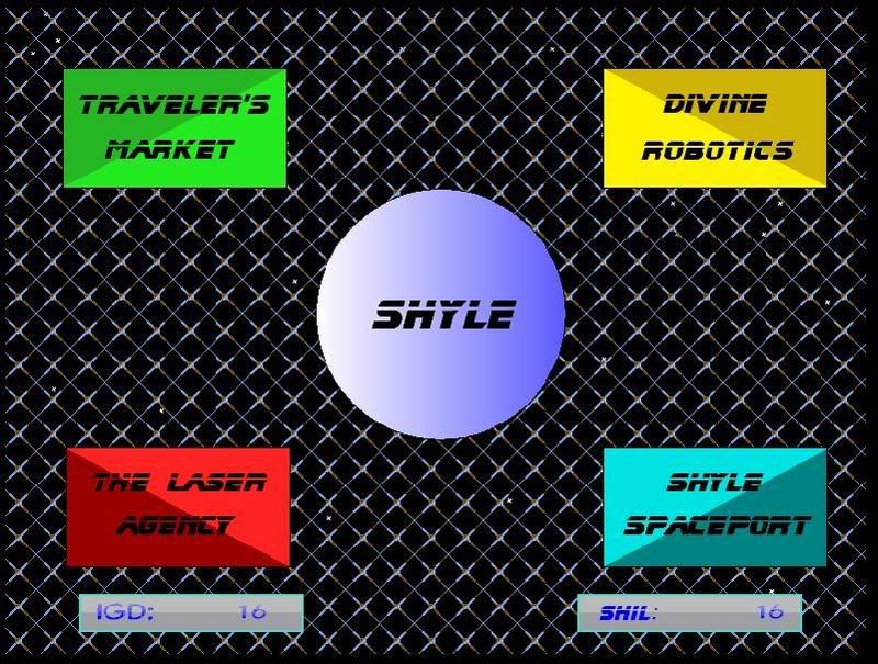
ok, a new screenshot will be coming tonight. It blows the socks off the old one. Also, the spacestation idea was scraped,and instead, it takes place on the actual planet of Shyle. I think you will like.

 
*Sephirenn*

Sephirenn

Possibly Insane

Registered
  1/15/2002
Points
  2344

360 OwnerPS3 OwnerWii OwnerI am an April FoolVIP MemberGOTW JUNE 2010 WINNER!
17th July, 2007 at 8:11:34 PM -

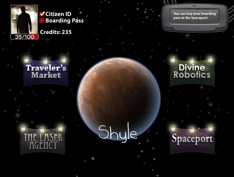
Although the final menu screen will end up looking very similar to this, this is more of a concept shot, as things like the profile picture with change, and details like that:

http://i113.photobucket.com/albums/n238/Sephirenn/aerthy.jpg

Let me know what you think. Better than the last screenshots?

 
*Sephirenn*

waffleton


Registered
  4/20/2007
Points
  794
17th July, 2007 at 11:16:59 PM -

Well, it looks much much better, i must say that!
But the question is if it suits the in-game graphics. xB

 
n/a

Pixelthief

Dedicated klik scientist

Registered
  1/2/2002
Points
  3419

Game of the Week WinnerWeekly Picture Me This Winner!You've Been Circy'd!VIP MemberI like Aliens!Evil klikerThe SpinsterI donated an open source project
17th July, 2007 at 11:32:02 PM -

Damn son, that went from maybe a 3/10 to an 8 or 9/10, in presentation.

 
Gridquest V2.00 is out!!
http://www.create-games.com/download.asp?id=7456

waffleton


Registered
  4/20/2007
Points
  794
17th July, 2007 at 11:35:14 PM -

Yeah, it did. But if it doesnt match the in-game graphics, which im afraid it wont, then it will feel very odd and out-of-place.

 
n/a

Matt Boothman

The Nissan Micra of forum members

Registered
  9/20/2002
Points
  33

Game of the Week Winner
18th July, 2007 at 7:16:11 AM -

Brilliant. No improvements to be made!

 
http://soundcloud.com/normbo - Listen to my music.

Deleted User
18th July, 2007 at 7:58:53 AM -

You intentionally put up a shit screenshot so we'd all be like 'whoa' when you posted the real one.


DaVince

This fool just HAD to have a custom rating

Registered
  9/4/2004
Points
  8001

Game of the Week WinnerClickzine StaffHas Donated, Thank You!Cardboard BoxDos Rules!
18th July, 2007 at 8:06:23 AM -

Actually, that sounds about right, Phizzy.

Still, this will certainly do.

 
http://davince.tengudev.com/
Still a member of Ectoprods! If it still exists, that is.

Don't take me for a FOOL!

"you purple nurple " - Del Duio

Ricky

loves Left For Dead 2

Registered
  12/28/2006
Points
  4110

Has Donated, Thank You!Game of the Week WinnerVIP MemberWii OwnerHero of TimeGOTM Winner! - November 2009I am an April Fool360 Owner
22nd July, 2007 at 12:10:36 AM -

that looks amazingly good

 
-

Zezard


Registered
  7/17/2005
Points
  326

VIP Member
22nd July, 2007 at 2:51:32 PM -

Looks a bit like a Back Packer game...
Am I right that you are somewhat skilled with PS or alike, even though you are not a pixel artist? Well, then you don't have to care about the pixels, just use some photo source material and PS it to something good.
I don't get the lamps though, they seem a bit out of place to me...

 
http://create-games.com/project.asp?view=main&id=1217

Tim

I'm on here way too much

Registered
  8/25/2006
Points
  157

You've Been Circy'd!Clickzine StaffSilverNova MemberVIP MemberTurtle Power!Evil klikerWii OwnerHero of TimeGhostbuster!Pokemon Ball!
22nd July, 2007 at 3:56:33 PM -

Yeah I've read that Photoshop tutorial on making planets too, comes in pretty handy

That 'Shyle' text could do with a bit of touching up - considering its the name of the game..

 
http://www.SilverNova.co.uk


Windybeard Games


Registered
  4/14/2005
Points
  101

You've Been Circy'd!VIP MemberCandy Cane
22nd July, 2007 at 7:50:16 PM -

Hmmm i think i agree with phizzy here, but still the new one looks slick! i likeses

 
SWEEZY GUNNER! Coming soon.
http://www.create-games.com/project.asp?id=2205

https://www.facebook.com/SweezyGunner

Billybobjoe198


Registered
  1/12/2007
Points
  212
22nd July, 2007 at 11:32:37 PM -

It's bland

 
n/a

Sephirenn

Possibly Insane

Registered
  1/15/2002
Points
  2344

360 OwnerPS3 OwnerWii OwnerI am an April FoolVIP MemberGOTW JUNE 2010 WINNER!
4th August, 2007 at 8:14:15 AM -

I actually may have to convert to the old screenshot. The reason being that my friend doing the graphics (the PS stuff) is very busy and it seems unlikely he's going to be able to create the graphics for all of the different planets.

In addition, as someone has said, the actual gameplay graphics are not PS, and as such it is almost jarring to switch from a menu screen to gameplay. Being that the whole game is mini-games, that is a damn large amount of graphics to be replacing.

I am unsure how to to proceed from here. Was the original screenshot, once I took out the gradients, that horrible? Can I get away with vector/minimalist graphics when I have the new title screens?

 
*Sephirenn*

The Chris Street

Administrator
Unspeakably Lazy Admin

Registered
  5/14/2002
Points
  15321

Game of the Week WinnerClickzine StaffAcoders MemberKlikCast StarVIP MemberPicture Me This Round 35 Winner!Second GOTW AwardYou've Been Circy'd!Picture Me This Round 38 Winner!GOTM December Third Place!!
I am an April FoolKliktober Special Award Tag
4th August, 2007 at 4:52:19 PM -

Go simple. Even default button objects can look good if you know what you're doing.

 
London 2012 - Promotional Video
http://www.youtube.com/watch?v=W7CkIrx9mXY

http://www.acoders.com
http://www.youtube.com/tehowchies
http://twitter.com/thechrisstreet

Image

DaVince

This fool just HAD to have a custom rating

Registered
  9/4/2004
Points
  8001

Game of the Week WinnerClickzine StaffHas Donated, Thank You!Cardboard BoxDos Rules!
4th August, 2007 at 7:00:18 PM -

Compare your menu layout to other (commercial) games, then decide which one fits best for your game. I myself would think that having a few options below eachother would be good, especially if you add a simple effect like a horizontal bar following what option you're picking.

 
http://davince.tengudev.com/
Still a member of Ectoprods! If it still exists, that is.

Don't take me for a FOOL!

"you purple nurple " - Del Duio

Captivate


Registered
  9/1/2007
Points
  69
1st September, 2007 at 2:33:47 AM -

Collaborate, perhaps? Post a description of your project in the "Solitaire" area of the boards and ask for help with the game menu?

Just a thought...


I need a signature.

This is what I have so far.

They say that well begun is half done.
   

Post Reply


Advertisement

Worth A Click