The Daily Click ::. News
 

TDC's News Update
News posted 16th June, 2008 by Rikus  
Well look at that we are trying something new -shock and horror- Comments suggestions let us know!
Demo: CLIFFALL
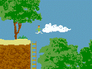
Comments from Author: Earn points by eating "a few" fruits and colecting "some" treasures. No shooting, just jumping and colecting and a bit of exploring so far. Music is not there yet but environment sound effects are, which are nice, like birds singing and water sounds.
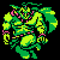
Project: Dark Reality
Comments from Author: Dark Reality is a 2D Survival Horror game being made by me Martin_Bodger and Dynamite. I handle the ingame graphics and programming and all that. Dynamite handles the cutscene artwork.
News: New Donation
We Received a new donation today from the one and only.. Santa Claus! Yes he send us 15 pounds from Spain were he is currently enjoying some cool margaritas on his well deserved vacation. Claus you rock!

Also thanks to Justin for inspiration because of his update mockup he created in the forums!


Posted by Hill Gigas 16th June, 2008

Very nice! I like this format better than the old way.
 
Posted by Pixelthief 16th June, 2008

I like pictures!
 
Posted by Cecilectomy 16th June, 2008

is this a news post? or is it gonna be a perma banner at the top of the news page like i thought justin was implying? anywho it looks niiiioce!!
 
Posted by Rikus 16th June, 2008

It is a news post, clubbie is still working on a idea to have a randomly generated banner with pictures for downloads and projects.
 
Posted by alastair john jack 16th June, 2008

nice!
 
Posted by JustinC 16th June, 2008

I like it. But you definitely need my bar
 
Posted by ~Zigzag~ 17th June, 2008

Its much better than the block of text. It also means I can ignore peoples demos with ease
 
Posted by Ski 17th June, 2008

I think it looks a little odd.
 
Posted by Dr. James MD 17th June, 2008

Nicely done, I think it's a little cramped on my 1024*768 laptop but meh! Probably looks brill on my proper computer. Thumbs up!
 
Posted by Simon Colmer 17th June, 2008

alot more professional looking! A+++++
 
Posted by alastair john jack 17th June, 2008

Do you think instead of "Comments from the author" it could say the actual author's name, so that there is a way of knowing who the author actually is?
 
Posted by -Dark Martin- 17th June, 2008

Well would you look at that, my project made the homepage.
 
Posted by Johnny Look 17th June, 2008

Love it
 
Posted by Marko 17th June, 2008

Like it alot, very clean and crisp!
 
Posted by -Dark Martin- 17th June, 2008

"Love it"

I'm not sure what people are loving here?
 
Posted by Codemonkey 17th June, 2008

I like it.
 
Posted by -Dark Martin- 17th June, 2008

Like what!?
 
Posted by Jon Lambert 17th June, 2008

I agree with Dr. James, but it's okay.
 
Posted by -Liam- 17th June, 2008

Looks good! I like it.
 
Posted by OMC 17th June, 2008

Martin, the new news layout. Looks Awesome. Fantastic job!
 
Posted by -Dark Martin- 17th June, 2008

Ooo, ok.

A lot more nicely lined out.
 
Posted by Torava 17th June, 2008

Looks far better, but it doesn't work correctly on 1024x768 resolution. It stretches the page. You should fix that.
Comment edited by Torava on 6/17/2008
 
Posted by JustinC 17th June, 2008

What do you mean stretches? When I resize the window to 1024 it just crops off a tiny bit of the downloads sidebar. Which could be fixed if the images were all kept the size of the 2 on the left. The donation pic is just wider.

And for anyone still using 800x600 don't even bother complaining! Crank it up to 88mph and welcome to 2001.
 
Posted by CoolDude330 17th June, 2008

Looks much better!
 
Posted by Johnny Look 17th June, 2008

i was talking about the template.
 
Posted by Torava 17th June, 2008

"When I resize the window to 1024 it just crops off a tiny bit of the downloads sidebar. Which could be fixed if the images were all kept the size of the 2 on the left."

That was what I meant and yes, it is fixable easily. I just don't like sites which has horizontal scroll bar.
Comment edited by Torava on 6/17/2008
 
Posted by Knudde (Shab) 17th June, 2008

I like!
 
Posted by -MacAdaM- 17th June, 2008

Thats pretty nifty, but I would make the images a little smaller for 1024*768 Resolution. So all the images fit, Then it would be a nice little face lift for the website.
 
Posted by chrilley 18th June, 2008

Excellent.
 
Posted by Klikmaster 18th June, 2008

I don't like the new layout. From a design perspective it's all a bit disproportioned, the way that each column is a different width, and if 1 column get's much bigger than the others there will be a horrible gap.

I vote for the old layout to come back!


Author Info

Advertisement

Worth A Click