The Daily Click ::. News
 

GOTW: 6th September 2003
News posted 6th September, 2003 by ShadowCaster  
I realise it's been a while sorry everyone, university is keeping me extremely busy...

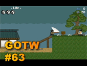
This weeks winner of the GOTW award is Dave C for his Competition Winning game Fighting Spirit. Also worth a mention is Evil Dead 4 which came very close to winning.

Next Week's GOTW Will Feature:
Super Ken Senshi, Sideswipe, Legacy of Flan, Ray Bexter, Thod II & Legacy of Flan 2

Sorry to everyone that voted in the first five minutes after I uploaded the new GOTW poll, there was a problem and I had to upload it again (removing the 2 votes that had already been registered in that time ).

I wont be able to update the poll and GOTW next week as I'll be at Supanova Friday, Saturday and Sunday, so these polls will last for at least two weeks.

I've created a new heading for DC, tell me what you think by posting a comment to this news article. Do you want to keep this one, revert back to the old palm tree one, or use a different one entirely?

~Commandant


Posted by The Chris Street 6th September, 2003

Wow a new look! Someone on the forums suggested that the GOTW polls should be automated. For example, every time an admin accepts a game, there should be an option as to whether the games worthy to add to the poll. And every Saturday it refreshes, and an admin writes the results. I think this is a great idea :)
 
Posted by The Chris Street 6th September, 2003

Oh, this headings a bit plain..needs more to it :D
 
Posted by Blackgaze 6th September, 2003

oh nasty. Legacy Of Flan, Legacy Of Flan 2 AND Super Ken Senshi in the same GOTW. This is going to be a nasty gotw. I really like Super Ken Senshi, but i also like LOF 1 and 2. oh... help!
 
Posted by Ashman 6th September, 2003

I say you vote for the crappiest game, just to be fair.
 
Posted by Assault Andy 6th September, 2003

SC i think the new design is cool. Looks all metaly. Btw come on MSN and talk QLD. -Andy
 
Posted by Matt Boothman 6th September, 2003

I think we should have a different design on the top. The bar for the links looks a little weird as the text isn't vertically aligned in the middle. This new banner is plain, but not the good kind of plain.
 
Posted by Strife 6th September, 2003

Make a new palm tree for the heading. I'm not saying that the one we have now is bad, but look at the water in the background! Yuck! What is that, JPEG format?? I'd prefer GIF...
 
Posted by TomH 6th September, 2003

Dwight: Myself and ShadowCaster both have Maya. So if wanted something that was 3D i think that we would have allready made one.
 
Posted by TomH 6th September, 2003

Also, Andy, http://www.supanova.com.au/ Shadow will be there voleenteering there each day.
 
Posted by OOOPPPs 6th September, 2003

sks all the way
 
Posted by SoftWarewolf 6th September, 2003

the last one was better but i love some variation ;) please change again in a month or so :P
 
Posted by Phredreeke 6th September, 2003

ummm... Anyone know what happened to the Legacy of Flan games? They're not in the GoTW poll, and I can't get to their pages.
 
Posted by Keatonian 6th September, 2003

I like the new heading! WAIT! Me got idea....
 
Posted by Rik 6th September, 2003

"ummm... Anyone know what happened to the Legacy of Flan games" good question.. i like the new heading banner, except that the links arent in the center of the grey bar.
 
Posted by Keatonian 6th September, 2003

Look at the two images in this zip Shadowcaster! http://keatonian.tripod.com/KDC.zip Even if you don't like them, they were fun to make.
 
Posted by Keatonian 6th September, 2003

Save Target As :p
 
Posted by Zap{Zapdude Productions} 6th September, 2003

i reckon the new ones wicked, although there should be a smiley or an imageo n the right side of the banner
 
Posted by Keatonian 6th September, 2003

Zap, right side would be kinda hard... (It changes depending on resolution.)
 
Posted by Rikus 6th September, 2003

What about this one: http://www.create-games.com/images/september.jpg
 
Posted by The Chris Street 6th September, 2003

we need a completely different font, Rikus :D Oh and the background should be a proper pattern. But I like those little guys...perhaps there should be some from various klik games?
 
Posted by Tigerworks 6th September, 2003

Rikus' one is good, use it! :D
 
Posted by Pete Nattress 6th September, 2003

yay, the new header is cool. but put the grey bit up so the text is vertically centered. rikus's one is also nice.
 
Posted by Rikus 6th September, 2003

oh btw the little guys where made by: Podge - Scorpion E and some by klikmaster. Created for the dc-chat:) Hopefully they don't mind i put it on the banner.
 
Posted by The Chris Street 6th September, 2003

URGH GOD, Blue and such an intense orange dont go well together XD. In the name of Gordon Bennett, change one of them (and change the font! its boring now)
 
Posted by ShadowCaster 6th September, 2003

I changed it back to the blue one at Circy's request :)
 
Posted by The Chris Street 6th September, 2003

Ah, so there is at least ONE person out there who listens to me ;) Still, change the logos font and spread it out a bit, and I reckon it'll look neato
 
Posted by CYS 6th September, 2003

I like it.
 
Posted by Rikus 7th September, 2003

I would go for this one;) http://www.create-games.com/images/september.jpg
 
Posted by Rikus 7th September, 2003

Oh wait i made an ever better one: http://www.create-games.com/septembercool.jpg :)


Author Info

Advertisement

Worth A Click