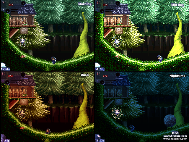
So production on Asunder has been chugging along lately! Lots of work getting done! Cranking all the gizmos and shoveling more coal into the doohickeys! So I thought it would be nice to see what people thought of the quality that my current graphic artist has been churning out. I'd like any feedback on how it looks, if it should be good enough to chug along with or if I should look into getting someone new!
Any feedback welcome, be harsh!
Also, keep in mind that the player sprite here is *not* part of the final gfx, these are just to show tilesets & backdrops
The player sprite is just a placeholder. The rest are not!
Hmm. For an engine like this I think its a shame to waste it on a red alienish/cavish enviroment like this. Don't get me wrong, the graphics aren't bad, but I think it could be a lot prettier like grass planes, blue skies, cumulo-nimbus/cirrostratus clouds, forests would have been prettier.
I think I agree with Adam in the sense that it leaves something to be desired. In my opinion, a more colorful and surreal environment would work wonders with a game like this. Imagine forests with twisting trees/branches, coral reefs, astroids made of colored gemstones with beams of light pouring out of them, maybe even orbital outposts of steel.
Of course, it depends on what kind of style and story you're aiming for, but even with something dark and sinister, a large variety of scary backdrops would do wonders - balls of junkyard metal, alien spacecraft/buildings with moss growing on them, mysterious temples, etc.
It's not a million miles in quality from the demo graphics to be honest - that 255,0,0 red environment is going to be insanely hard to do convincingly, whoever you are. The background comes off as a kind of unattractive mottled grey. A more careful selection of colours (including stripping out some unnecessary tones and textures) could work wonders for the whole scene.
I can't think of many games that use lo-res graphics plus extravagant hardware effects so it's a toughie. Have you considered a seriously more clean, stripped down look?
The graphics look good and i can't put any fault into any of it. I agree with the others though, i can't feel myself being pulled-in by it all at the moment. The video does it more justice than the pics. However, without knowing what the game is about, the story or how the action/puzzles will play, it is hard to say whether the art-direction actually fits properly.
It's good, it's great, it's just not jaw-dropping. However, it could be if it is designed to fit around the right story, action, puzzles, etc.
I think the cloud thing around the character's animation is a bit too rough. Everything else is pretty smooth, but the cloud thing surrounding the character just looks weird to me. Other than that, the graphics are very nice. I disagree with the people, and think that the cave is fine, it just needs some more work. If you want to get fancy you could add a fog effect to the front, as opposed to just in the background, but just adding more scenery (obstacles, enemies, stuff like that) and perhaps a bit more detail would make it much nicer. The background looks fantastic, but the foreground looks rushed compared to it.
If you do decide to go with a more light atmosphere, you should probably change the character, as I don't think a black silhouette would fit a happy plains stage. Possibly a forest stage if you make it a dark one. But it's up to you, those are just my suggestions
If you put a million monkeys at a million keyboards, one of them will eventually write a Java program.
The rest of them will write Perl programs.
Thanks all! First- for those who didn't guess it already, I drew all this. I've had such difficulty trying to set up this project that I thought I'd try my hand at doing it all, but I wanted some honest feedback to see if its worth continuing on my own, hence the minor trickery.
And yeah, the player silhouette & sprite is *not* part of the final graphics, thats still a placeholder- haven't started on anything but tilesets & backdrops so far. Ditto with the save spot, but that crystal does indeed stick out like a sore thumb, I think I'll tone it down a few shades and add a better connection to the red rocks to make it less jarring, good advise there.
I guess the "not terrible" reaction is the best I could hope for. I know its not going to be as great quality as a dedicated pixel artist or professional graphic designer could manage, but thats the tradeoff for having everything cling to a single vision and have work chug along full speed without any bumps.
I know Adam is a sucker (in the good way!) for cutesy and bright environments and vector art, but indeed I was hoping to take a darker tone at least for the specific area this is set in. I plan to have the game divvied up into 3 main overworlds, so there should be room for completely different art styles and tones. I'm not planning to make the entire game follow the Red/Purple color theme, but I did want to have the color theme strongly pronounced in each area. Maybe this is too pronounced, and I should expand the palette a bit more? It would be hard to pull off, even if I'm mixing it up down the road. Think Hero the movie, with its different color theme to each story.
But I would like those big twisty windy forest and grass plains and mysterious temples, and I'm afraid its going to be a huge hurdle for me to draw all that, and my best hope is that I can improve as I go on, so I figured I'd start it up easy. I can always go back after all. But I think monkey is right- I need more doodads and backdrops to break up the monotony of all these tilesets, its not quite convincing as is. I'll need to brainstorm a whole bunch of ideas though, its hard to come up with stuff beyond just "craters". Maybe I'll try some alien plants, but I don't want to give it an organic vibe due to the emphasis of this area (intentionally meant to be desolate and dark, to contrast with the other two main areas)
And yeah Duncan I might return to the concept stage for a bit to through up some mockups of a more minimalistic tone. I know I could pull out some detailed textures for greater effect, but its again a question of if I can pull that off well and I'm no expert.
Thanks though all, if anyone else has feedback I'd love to hear it. Especially the critical stuff, don't worry I packed my ego with a Lazy Shell and Safety Badge before I put this up
"I know Adam is a sucker (in the good way!) for cutesy and bright environments and vector art, but indeed I was hoping to take a darker tone at least for the specific area this is set in.
Not to steal the thread but I like doing all kinds of art, I just rarely finish projects.
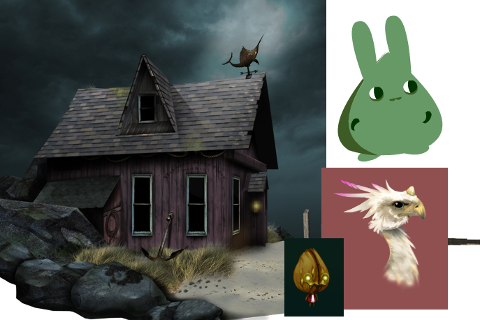
That creepy house of yours looks awesome, but its still 2 degrees removed from a gingerbread village
but yeah good non-vector stuff, nice to see multi-talent.
Back on topic, I think an unusual game deserves a picturesque setting to set it off nicely.
Even if the storyline/area is dark, Id use darker colours and really play more with the lighting and atmosphere. You've added mist in the background or w/e, but the foreground just looks like some blood-red, pixelly tileset, because it has very little shading and the main body of it is all one colour with a really busy texture pattern going on. Personally, Id use a dark shade, perhaps almost black and use reds where the light hits the surfaces (although this may look odd in places considering how the engine works)

 Advertisement


 )
)


