Wow... It's my first post on The Daily Click. I will treasure this day forever.
Maybe.
Anyway, after browsing through many of the posts on these boards, I've seen a lot of amazing sprites and art styles. Some are more realistic, and some cartoony. Some are anti-aliased and soft, while others openly celebrate their pixelation. I've always tried to go for the "soft" look in my sprites, but I've never used any advanced software to create them. Recently, I realized that using the color of the outline - instead of making it black - can make a huge difference in the appearance of a sprite.
So I guess my questions for discussion are: What style do you strive for and why? Like, what kind of inspiration do you use, and, when creating a sprite, what goes through your mind as far as, say, the color of the outline, the number of colors used and such? I'd really like to learn how others approach this daunting/rewarding art.
Here's a few of my sprites from "The Way Back." It seems there's a strange mix of cutesy/Ugly in my work 0_o.
That was one whopper of a post. I promise I'll try not to talk too much in the future.
Edited by MeadowHare
Dedicated to Making the Most Docile Games Possible.
I like to go for SNES-level sprites that try to be that "soft" type (usually cartoony so I can exaggerate features and make them absurdly hilarious looking). I've never really been fond of (purposefully) drawing pixelated art even though it's easier, but I do enjoy others' retro-type art. Especially if the game is fun! I just don't like to tout the fact that it's pixel art.
However, judging from your excellent sample, I should be asking how you approach pixel art! Mine's crap! I seem to have trouble with hitting the right balance when it comes to contrast.
In my earlier years of game development, I did indeed use black outlines for my sprites. As time marched on, however, I ditched the black outlining and instead focused on a soft style of shading, much like yours MeadowHare.
Nowadays, though, I've completely ditched the shading entirely, and my style focuses mainly on solid colors. I've heard people compare it to a cutout style, like South Park, and others have said that it resembled vector art, though that's obviously not the case. ;
Here are some examples of my most recent stuff:
The lack of shading makes my sprites look very simplistic, and in some cases, amateurish if I don't choose my shapes and colors wisely. However, I believe that the benefits far outweigh the downsides, because the lack of shading means that I can put greater focus on smooth, expressive animations. Not only that, but it makes cutscenes and large backgrounds considerably easier to draw, which is a huge bonus for someone like me who works alone and needs to do everything him/herself.
So, yeah, that's the Way of Strife. And MeadowHare, don't worry at all about creating lengthy posts. The Daily Click needs more open-minded individuals such as yourself, and you're totally welcome to it. =D
Strife, the animation on that fox is awesome. I'm terrible at animating sprites but I love drawing static ones or big stills.
My style is a cross between NES and SNES. Honestly I like the look from that era for games the best and don't really want to go too much further. You can pretty much get your point across with a style like that anyhow, and much better than something really old like a lot of Atari games (using a single square for the hero, like Adventure did.)
--
"Del Duio has received 0 trophies. Click here to see them all."
"To be a true ninja you must first pick the most stealthy of our assorted combat suits. Might I suggest the bright neon orange?"
DXF Games, coming next: Hasslevania 2- This Space for Rent!
Wow, Strife, your sprites are really awesome! As Del Duio said, the animation on the fox is superb. Your style also offers a lot of personality in the characters.
It seems like most people here like to go for the NES or SNES styling/quality. I've seen a lot of "Click" games that use what look like Photoshop filters, gradients, lighting, etc. Seems like those are the ones that are labeled as more "Professional", which sometimes makes me sad, since spriting is just as much work as using filters and such.
At least we have "Cave Story" to bring people's attention back to good old sprites.
Dedicated to Making the Most Docile Games Possible.
Most of my characters use the anthropomorphic animal style popularised by Mickey mouse then again by Sonic the hedgehog.
I try to make my sprites look like a smaller version of my own drawings (to a certain extent).
But actually Ive used different styles based on what game I'm making. I don't think you have to limit yourself to one style.
I even used a double pixel width sprites in one of my games 'Arnold's adventure'.
Btw, I don't think Snes counts as a style. Just like MMF2 isn't a style.
I think that the style you aim for is pretty much a matter of personal taste, be it retro NES/SNES styled sprites, smoothly shaded filter effects, or something in between. Pretty much any style can work with an indie game as long as it's centralized/stylized enough. With my style, it would be very easy to end up making something that looks like was sketched in MS Paint, which is why I choose my colors very carefully and keep the animations moderately smooth when possible.
My style is changing all the time. First it was super soft (almost blurry), then sharp and outlined, then softish cartoony, then no outlines at all. It depends on the game and my mood.
I really have to put some work into improving my spriting skills if I'm ever gonna catch up with you guys later
I tend to use a hard black outline, because that's what Derek Yu taught me. I'm more into a darker outline now, like dark purple for a purple guy, but it still stands out. I want to move towards the softer outline that you guys are doing.
Disclaimer: Any sarcasm in my posts will not be mentioned as that would ruin the purpose. It is assumed that the reader is intelligent enough to tell the difference between what is sarcasm and what is not.
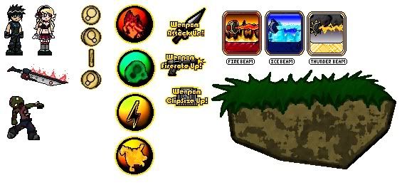
Everyones sprites vary, i like to see so many different styles out there! a lot of people do go for the nes style, which i think is pretty cool. makes it look classic, but classy at the same time. i prefer a mix of different types of sprites, some smooth, some pixelated, some with black outlines, some with colored outlines, some without outlines at all. heres an example of the sprites im using.
lol didnt realize that till a while after i posted
what do you mean i need to work on my coloring? and yeah, didnt intend to save it a jpg, it makes it look terrible. :/
[Game design makes my brain feel like its gonna explode.]
Originally Posted by siven lol didnt realize that till a while after i posted
what do you mean i need to work on my coloring? and yeah, didnt intend to save it a jpg, it makes it look terrible. :/
The shading on the characters makes them look flat like paper. They need more contrast, maybe some subtle hue-shifting, and you could also try no black outlines.

 Advertisement


 Edited by MeadowHare


 I seem to have trouble with hitting the right balance when it comes to contrast.


