The Daily Click ::. Forums ::. Digital Works ::. Life/Pain Photoshop
 

Post Reply  Post Oekaki 
 

Posted By Message

Silveraura

God's God

Registered
  08/08/2002
Points
  6747

Game of the Week WinnerKlikCast StarAlien In Training!VIP Member360 OwnerWii OwnerSonic SpeedThe Cake is a LieComputerChristmas Tree!
I am an April Fool
19th July, 2009 at 19:53:27 -

Image
I got into a creative mood one night and decided to try something I've never done before. Let me know how it turned out. This was done entirely in Photoshop. No other software was used. All shading was done by hand.

PS: If this isn't exactly your style, please avoid saying anything negative. I'll accept constructive feedback, but I understand that some people may not like this kind of style and I'd prefer less bias feedback.

Edited by Silveraura

 
http://www.facebook.com/truediamondgame

Marko

I like you You like you

Registered
  08/05/2008
Points
  2804

Has Donated, Thank You!Game of the Week WinnerVIP Member360 OwnerDos Rules!Happy FellahCrazy EvilI am an April FoolGingerbread House
19th July, 2009 at 21:27:00 -

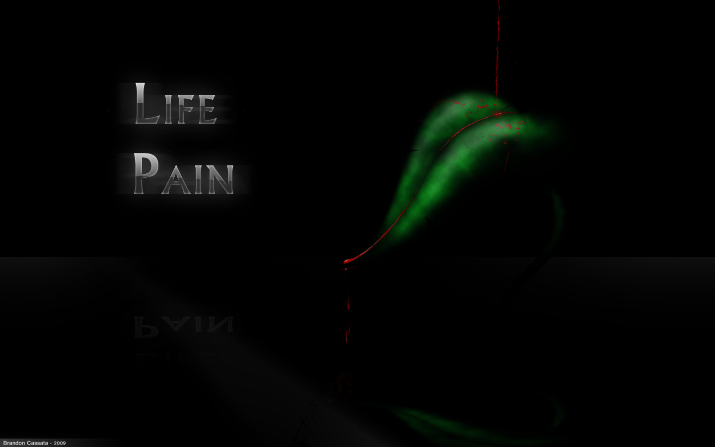
What's not to like? It's exceptionally well drawn and even better shaded. The blood stands out a mile off, which i like - contrast is good for me. Especially liking the shading to the plant leaf

 
Image

Subliminal Dreams. . ., daily gaming news and the home of Mooneyman Studios!
www.mooneyman-studios.webs.com

Matt Boothman

The Nissan Micra of forum members

Registered
  20/09/2002
Points
  109

Game of the Week Winner
19th July, 2009 at 21:29:44 -

Not sure of the texture on the leaf; I'd be expecting veins on the leaf and for it to have a waxy texture, this looks like it's made of felt.

Blood is very well done.

 
http://soundcloud.com/normbo - Listen to my music.

W3R3W00F

Drum and Bass Fueled Psycho

Registered
  08/11/2008
Points
  370

VIP MemberCardboard BoxThe Cake is a Lie
19th July, 2009 at 22:22:44 -

It's nice, but there are a few things that aren't really appeasing. It's just doesn't feel complete.

One thing I like about it is the concept. Blood running down the stem of the leaf. While simple, it's pretty interesting. I'm also very impressed by the forms of the leaf and blood. I found the mirror effect a nice touch. The lighting seems to be in it's right place too.

That said, there were some things that turned me off. One being the texture of the leaf. While it's a good texture, it didn't fit in being used for the leaf. I think it would be better suited for say, leather. I would add a touch of transparency and a different texture to give it more of a leafy look. On top of that add veins to it for an even better result.

For the blood, it looks a tad hard. Adding a brighter light to it should fix that to give it a liquidy feel. And isn't the color is abit bright? I would tone it down to a darker red for a realistic look.

 
n/a

[DELETED]

Likes to put dots on paper

Registered
  08/12/2008
Points
  118

MushroomVIP MemberARGH Sign
19th July, 2009 at 22:23:05 -

I must say Brandon, I do like your style. It's kind of like symbolic motifs and text meet high definition.
Let's see some more.

 
n/a

Devernath


Registered
  04/12/2004
Points
  54

VIP Member
20th July, 2009 at 01:30:49 -

I like it very much, and unlike everyone else, I think the texture of the leaf is fine.

I don't think you should have the words there though, and I would like the stem to be a bit more visible.

 
n/a

OMC

What a goofball

Registered
  21/05/2007
Points
  3516

KlikCast Musician! Guy with a HatSomewhat CrazyARGH SignLikes TDCHas Donated, Thank You!Retired Admin
20th July, 2009 at 01:38:43 -

The sharp perfection and shininess of the words don't match the painty feel of the leaf.

And that's all I have to say.


nim


Registered
  17/05/2002
Points
  7233
20th July, 2009 at 01:48:36 -

The gap between the P and A caught my attention right away. Needs a little more work on the kerning there. Otherwise it's really nice. I like the leaf.

 
//

Silveraura

God's God

Registered
  08/08/2002
Points
  6747

Game of the Week WinnerKlikCast StarAlien In Training!VIP Member360 OwnerWii OwnerSonic SpeedThe Cake is a LieComputerChristmas Tree!
I am an April Fool
20th July, 2009 at 05:49:49 -

I really appreciate all the comments you guys. The feedback was great. I'll go in and make some changes to it and see what you guys think of it afterwords. Plant texture and text are going to be my editing focal points. Thanks guys, you're great.

 
http://www.facebook.com/truediamondgame

Dr. James MD

Addict

Registered
  08/12/2003
Points
  11941

First GOTW AwardSecond GOTW AwardThird GOTW AwardPicture Me This -Round 26- Winner!
20th July, 2009 at 12:29:40 -

Thanks to my macbooks display i can see the background now. I think you should lighten that background because yea, it was too dark on my Dell monitor. I think the leaf needs saturating too, maybe add a ripple where the blood hits the water?

 
Image
http://uk.youtube.com/watch?v=j--8iXVv2_U
On the sixth day God created Manchester
"You gotta get that sand out your vaj!" x13
www.bossbaddie.com

Silveraura

God's God

Registered
  08/08/2002
Points
  6747

Game of the Week WinnerKlikCast StarAlien In Training!VIP Member360 OwnerWii OwnerSonic SpeedThe Cake is a LieComputerChristmas Tree!
I am an April Fool
20th July, 2009 at 19:06:36 -

Maybe you can up the Contrast and Brightness on your monitor? Is it an LCD? I use an HP LCD monitor, I wont use Mac.

 
http://www.facebook.com/truediamondgame

Dr. James MD

Addict

Registered
  08/12/2003
Points
  11941

First GOTW AwardSecond GOTW AwardThird GOTW AwardPicture Me This -Round 26- Winner!
20th July, 2009 at 19:49:59 -

No this is on my Dell 2007WFP monitor under XP. Can't adjust the contrast and stuff since I'm using a DVI adapter and its calibrated for print.
But yea it's completely visible on my LED macbook under OSX .

Ah well.

 
Image
http://uk.youtube.com/watch?v=j--8iXVv2_U
On the sixth day God created Manchester
"You gotta get that sand out your vaj!" x13
www.bossbaddie.com

OMC

What a goofball

Registered
  21/05/2007
Points
  3516

KlikCast Musician! Guy with a HatSomewhat CrazyARGH SignLikes TDCHas Donated, Thank You!Retired Admin
20th July, 2009 at 19:59:29 -

Wait, that's water? I thought it was a super-subtle mirror-like thing. Guess my display's too dark as well...


Silveraura

God's God

Registered
  08/08/2002
Points
  6747

Game of the Week WinnerKlikCast StarAlien In Training!VIP Member360 OwnerWii OwnerSonic SpeedThe Cake is a LieComputerChristmas Tree!
I am an April Fool
20th July, 2009 at 21:14:02 -


Originally Posted by OldManClayton
Wait, that's water? I thought it was a super-subtle mirror-like thing. Guess my display's too dark as well...


No you're right, there is no water. It is just a subtle glossy mirror-like surface. If you look closely (unless your display is too low), you can see blood running down off the surface.

Anyway yeah, I'm on a 1000:1 Contrast ratio LCD monitor with the contrast at around 70 and the brightness at 100. My blacks are solid black and my whites are solid white and everything else seems fine in between. I'm not sure if brightening it would be the best idea.

 
http://www.facebook.com/truediamondgame
   

Post Reply


Advertisement

Worth A Click