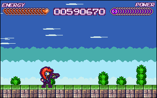
Right, thank you ever so much for your comments and opinions in the previous log. I've been working away hard, drawing concepts and spriting them too. This is what I've finally come up with. Its somewhere in the middle between the small and the big. Taken on board what people liked and disliked aswell.
(Comparison picture)
Also, I'm liking this idea of making all the main sprites have a sorta "glow" around them. Just makes it a bit more indie but still retaining a professionalish look. Meh, I think I'll go with the idea. But please say if it's a naff idea hehe =
hope ya like the new sprite. Your views have really helped me!
EDIT: Just a new hud aswell I forgot to include with this devlog.
Very nicely done! Only have a glow though if it makes sense! Right now she just has a purple outline. If you do want to have a glow, make the color at least stand out.
The outline is too harsh. It hides the detail of the actual sprite by being so dark. I like the new sprite quite a bit! Though I think I still like the first one best. X) Maybe it's because the new one's legs and feet are almost non-existent?
@Xhunterko: Yup the glow will make perfect sense as it's to help the "Twin" gimmick I have planned. It's not going to be purple. (That was just a placement colour), it's actually going to be bright yellow or bright blue. Think Ikaruga.[
@OMC: Big legs = Pain to sprite running animation. If I show her running then the legs/feet really show up. When it's animated you tend to see them a bit more clearly. But I'll see what I can do to bruce up the legs
Cheers for ya comments ^^ Comment edited by [Joel]-[Poobical] on 12/1/2009
Thats her running. (Dont worry I havn't forgotten her other arm lol. Thats a seperate object.) The yellow glow is to show what "polarity" your in.
That sprite seems ok. Btw the running animation is sorta based of something. (I've been hooked on playing it on my DS). Wonder if you can guess what game...
You can deal damage no matter what colour you are towards the enemy. However if your the same colour as the enemy, you can walk through him/her and absorb their bullets/attacks. But your bullets will only do half the damage. (and sometimes nothing at all)
However if your opposite colour to the enemy/bullet/attack then your attack towards the enemy is doubled but you can be attacked for double damage.
Then you can be neutral, and you do normal damage to the enemy, and the enemy does normal damage to you. (That wont have the line around the sprite)
With this concept, you can play around with attack patterns and make some puzzles within the stages. Plus it allows to players to come up with strategies on how to beat a level.
Just something new to just pressing right and firing at things
The line around the sprite is just to tell what "polarity" your in. It looks alot better than random coloured stars coming out. Tbh I could, just do a pallete change on the whole sprite. That might just work aswell Comment edited by [Joel]-[Poobical] on 12/2/2009
I was about to say I wasn't too big on the glow, but with the gameplay idea in mind, it makes sense to me!
Overall I really like the new sprite, however I think her hair should be shortened in the same fashion as the old sprite's. Other than that, it looks pretty darn great!
Dark purple glow is a bad idea. Use lighter colour for glows, to make sure your sprites will still stick out from any background. Also, why use both a glow colour and black on top of that? I think it'll dampen any glow effect you want to create.
Ah screw the glow. Taken it off. Looks cleaner. Also I'm not going to bother with that whole polarity thing. No need to. Too cluttered anyway. Things are running alot smoother now so cheers for ya advice guys (Hair's keeping the same though Werewoof on this character, her twin will have shorter hair though, so don't worry!.)
Expect a demo for christmas rather soon.
I've also edited the firing a tad. It's not 8 directions anymore, its just the four. (Up, Down, Left and Right.) Just something different, and I prefer it. Feels less Contra like now. Comment edited by [Joel]-[Poobical] on 12/2/2009
I'm not changing anything anymore. It's coming together all nicely. The reason why I've been changing things is because it's in the early development stages and I can try out with looks/plays good now and make a final blank engine.
Oh no I love Contra, been hooked on number 4 for moi DS. Just this shooting four directions seems alot more smooth and a bit different. =
Trust me, this demo is going to blow minds. (I hope.) Hahaha and it isn't what your expecting.

 Advertisement


 Though I think I still like the first one best. X) Maybe it's because the new one's legs and feet are almost non-existent?


 Favourite