|
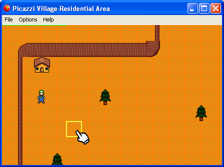
I took about a 2 month break from the game, entered a halloween compo, made a game called Slaughter, and did a couple of other stuff. When finally looking back at the file, I didn't know what to do. Some part of me kept screaming at me just do it over, go ahead and waste some more summers. But part of me didn't want to. So I'm almost starting over, it's not as nooby now, no push buttons, has scrolling text. Plus I decided to get rid of the ripped sprites, so at least it can be a somewhat respected fan game. Go ahead, click on the pic. That's a some custom graphics I've been working on, they look great and I plan to use them. So yeah, I'm gonna waste some more summers on this. (Well hopefully only one more, but you never know.)
|

|

 Advertisement


 I was to lazy to resize at the moment. The actual game will be zoomed in more, this is just zoomed out so you can see it better.
 PNG?
PNG? 

 Huh, what's a good way to shrink the window size without window control, because it resizes the game for some reason...

 Favourite