Well I decided to re-hash/re-design the Toast game for my final piece of coursework for university. I originally was going to submit the Toast game I was working before but my lecturers thought it was pretty bland.
So I went back to the drawing board this week, re-edited mostly everything and now, I present this:
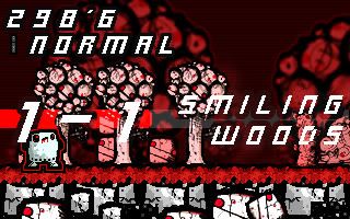
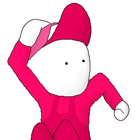
Everything thing except the Toaster/Enemy/HUD sprites are hand-drawn and scanned in. Hopefully I've unblanded (if that's a word) and given it some umph.
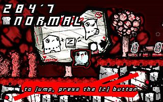
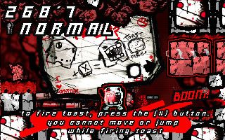
The game is about a living toaster that has to save this world from evil smiling goons, he does this by spitting out toast.
The game is going to be a short little game because it's for my coursework and it needs to be finished by the end of March. I'm also hoping to port it to flash, when I get around to buying the flash exporter.
Anyway yeah it's going to have around 20 shortish levels and a handful of bosses to defeat.
I don't think the graphics had much to do with the blandness. I watched this video, and with the knowledge that your professors thought the old game was bland, I watched the old video again. I think it's more the gameplay that make the game(s) bland. You move slowly, levels are sparse and one-dimensional, enemies don't seem to pose much of a challenge. You're just moving right, jumping a few times and shooting some things other times. Mr. Toast also had a pacing problem from what I saw in the other video.
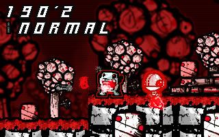
Ah yes, I see where you're coming from however I'm only showing off the first part of the level. The other levels, the enemies are different and there are a lot more gimmicks and gameplay mechanics placed in. For example like, squashers, conveyor belts, scrolling levels and having different toast abilities.
I didn't really want to show off to much of the stuff at the current stage because it's close to completion. My lecturers did say it was the artwork when I was in the meeting because they've seen other levels except the videos I shown 'ere.
Although I agree, the first level does look/play boring but it's only meant as a training level and nothing more = Thankies for the criticism though, because it would seem I still need to bruce up this stage or include it as an option to play, something I wasn't considering till now. =
I'm sorry but I don't like this. The hero doesn't even look like a toaster at all. He looks like a poor-mans version of Meat Boy that has lost all color. When I look at the images you've drawn for the tutorial all I see is a white Meat Boy. Also the gameplay looks very uninspired as well. If this was a Gameboy game from early 90s I would understand the bland gameplay concept, but in this day and age you need a bit more than run&shoot to make people interested in your game. Take a look at modern platformers for the console of your choice and see all the interesting features those games have. Then compare to the feature you have.
Don't want to offend you in any way, I respect the hard work that goes into these kind of games. You are asking why your game seems bland and I say your gameplay seems to offer little to nothing compared to games that came out for the original Gameboy in early 90s.
Ill be honest i have to agree with blue66's post. i really liked the way the game looked before, and i dont know why you changed the entire idea. the toaster doesnt look like a toaster... i liked the toast, and the other colors other than red. made the game seem kinda darkish, and that doesnt exactly fit the mood for a game about toast and a toaster. mechanics are lacking as well. walk shoot and jump doesnt seem to grab too many peoples attention anymore... i think you had a better idea going with the other design, although this is just personal opinion of coarse. regardless, this still looks good.

 Advertisement


 Thankies for the criticism though, because it would seem I still need to bruce up this stage or include it as an option to play, something I wasn't considering till now. =


 Favourite