There is absolutely NO excuse to make an ugly game.
NONE whatsoever.
So often, we see examples of games that are just plain ugly. There's so little attention to detail, it's nauseating.
In art circles it's a fairly established fact that ability isn't a huge limiter. Obviously some people have more talent than others, but talent is simply a jumpstart. Like some people can do larger, harder sums in their head because math is their talent. For the rest of us mere mortals, we learn techniques that enable us to work out that same sum on paper.
At the end of the day, the answer is the same, just worked out using rules and logic as opposed to natural ability.
The principle with making a good-looking game is similar. Not everyone is going to make a game with glorious pixel art and smoothly framed animations. However, when you look at some of the games posted here, the authors simply have no idea.
This article's purpose is to rectify that situation, and point out a few hints and techniques that should enable anyone to make a game that looks PRETTY! (wooyay)
Pointless analogy that you may want to skip:
I have always been particularly bad at maths. Turns out I have a form of discalculia (the mathematic processing version of dyslexia). The dcalc affects only my mental arithmetic, but because i always felt I was bad at maths, I never bothered to learn any of the methods. So my ability to work things out even on paper was very dodgey.
This often happens to people who don't like/are not good at art. Because art doesn't come naturally, they cease to try. They never take art at a higher level, and they don't listen as teachers explain colour wheels and what-not.
As in my case, however, you can simply learn technique. That way, even if you can't do the sum in your head, you can quickly sort it on a piece of paper or a calculator. And that's how I survive.
Similarly, there are tricks of the trade in art that anyone can learn.
Here, we're going to consider ones that apply to prettifiying your game.
Tools
One of the big excuses I hear from people is that 'Photoshop is too expensive' or more commonly 'Photoshop is too big to download', or sometimes 'Photoshop is complicated'.
Answer? use something else. Shockingly, there are millions of free or cheap apps you can use to draw/design in. Even more shockingly, many of them are rather good. Examples that I use:
Paint Shop Pro X - £44 from Amazon.
This will do fundamentally everything you need it to. Photoshop is so expensive because of all the millions of hidden features that you're likely never to use. And it's a brand name - like the difference between Levi jeans and Tesco Value.
The GIMP - FREE
If you can't bear to part with £44, this app is free. It's designed under the GNU license, and ported to Windows (originally designed for Linux). It has a lot of features like vectors, layers, etc, which are handy.
Graphics Gale - FREE
Pixel animation program with some handy features, including layer and alpha channel/PNG support.
You can also make seamless tiles really easily in this.
InkScape - FREE
A vector art app, designed as a free alternative to Illustrator. This isn't so useful, but I use it to vectorise my hand-drawn art. It basically traces my black and white drawing making it super smooth. It can also vectorise sprites...
Its main uses come in designing splash screens for games. If your art is good with a paper and pen, you can use InkScape to make your lines look smooth.
TGF/MMF's own editor - FREE
This is actually the weapon of choice for a lot of graphics people.
MMF2's editor, although a bit limited for me, does have some cool animating features, such as forward and backward onionskinning. This effect is nifty, since it displays a faded version of the previous/next frame behind the current one. You can use these as references when you're drawing the in-between frames.
Paint - FREE
Personally, I don't like paint, it's a bit too featureless for me. But hey, it's free, and many people swear by it.
You have NO excuse! Apart from PSPX, everything here is free. And frankly, the only reason I favour PSPX is because on windows (for me anyway) it's faster and smoother than GIMP.
Pixel Art
Right, some tricks of the trade. I'm also not talking as an expert here, btw. There are a lot of artists on the DC better than me who could probably add to this subject. If you're one of them, please by all means post some comments to expand this.
STARTING OUT
Start with a background colour that you definitely won't use in your image.
I personally prefer to start with PINK, since I almost never use it in my sprites.
It can be an idea to sketch ideas for sprites on paper, so you know roughly what you're gonna do. Some people (including me at times) find it helpful to actually draw your sprite on paper, scan him, resize him, ink over him in pixels, and then animate him digitally. I don't do this often, but it's an option if you need it.
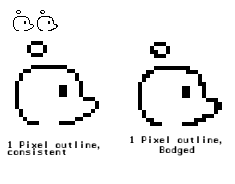
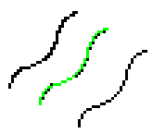
LINES - Thickness
Generally, try to keep the thickness of your lines consistent.
This picture below should show what I mean.
See how in the first image, no two pixels in the outline are ever next to each other.
This creates a smoothness when you look at it.
On the second image, some of the pixels overlap. Where they do, the line looks jagged.
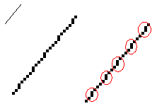
LINES - Construction
If you're designing a large background, by all means use the Line Tool. But rarely when building a sprite (unless you're drawing a totally straight line). Let me demonstrate:
This is ugly. See how the line appears to step? I've highlighted the steps with red circles. This is the kind of effect you'd use if you wanted to draw the side of a tiled roof or something - but at least then it would be deliberate. It simply doesn't work as a smooth line.
The reason this has happened is that it's trying to draw a line at an angle that cannot be expressed well in pixels. You're far less likely to encounter this if you draw the line yourself.
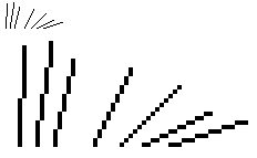
When drawing a straight line, the steps need to be the same size constantly. Otherwise, you'll get this jagged step effect. Have a look at these lines: They're all much smoother...
They allow your eye to follow a line, whereas with the stepping, your eye's not quite sure what line to see. The pixels are forming a 30 degree angle at one moment, 45 the next, then back to 30, it looks confusing.
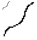
LINES - Curves
Suppose we try to draw a freehand curve. We get this:
Note how it actually violates one of the first rules we considered. It doesn't preserve the thickness of the line. Sometimes it's 1px, other times it's 2px. It looks jagged and messy as a result. Let's instead have a look at how we could smooth this line using another colour:
See how it's been smoothed out? When drawing a curve, we keep increasing or decreasing the size of each 'step'. If you practice drawing some curves, you'll get to the point where you kind of understand them. You'll appreciate that if you change the location of one part of the image, the entire curve will alter in a certain way.
Your brain already has an understanding of that built in, so you should grasp it in days. We'll consider this a bit more when we get onto animation.
LINES - Softening and Colouring
Lol, why do I get the feeling this article's gonna be huge? Sometimes, a black outline isn't that great. It can be, but not always. This depends very much on the style you're working with. Let's see how we can make it better:
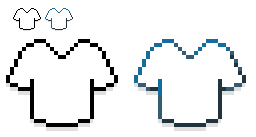
Here, we've changed the black outline to a dark green outline. Ignore the 3rd image for now.
Why have we greened the outline? Because it gives us an extra set of pixels to work with. By defining the outline in black, we lose a lot of pixels that could have been spent on other things. While the black outline defines border, it has no value as far as colour is concerned. By colouring the border a darker shade of the fill colour, we can use it for both. It's a more effective use of space.
There's also another reason. Look at this:
What colour is the 1st shirt? White.
What colour is the 2nd shirt? White.
So what have we done? We've begun to express a different shade of white. In fact, it's not even a shade, it's kind of a hint. This is *brilliant* white. Daz Ultra white.
And what's more, it's shaded! The body of the shirt contains no shading, yet a rough idea of its 3-dimensional form is visible from the line shades. When someone comes to shading the inside of this sprite, only a tiny bit needs to be done to add to the effect already created in the outline.
If we had a black outline, this would not have been possible.
Now briefly, go back to the previous example - the smoothed out line (the 3rd image we told you to ignore for now). This is NOT antialiasing. This is just adding a bit more variation to soften the lines and make the image a bit easier on the eyes. All you do is find a bit where two pixels form a corner and pop in a shade somewhere between the outline colour and the body colour. Don't do it everywhere, only where your eye feels it's necessary (it may not be necessary at all). The Snes Zelda games used this to good effect (A Link to the Past).
Right, I think I've done lines to death now. I'm keen not to go too deeply into shading since there are a million and one articles about that. But we will consider it briefly.
SHADING - Use your brain
That's basically it. People don't tend to realise that their brain has seen literally trillions of examples of shading. All you do is pick a direction for light to come from and pick steadily lighter shades. All you need to do is practice, which will form new connections in your mind, gradually enabling you to express your knowledge of shading using pixels. The simplest example:
It's not great, but you can see the highlights and shadows. Combined with some line shading, it looks alright. I'd be happy to have that as the head of an in-game main character.
Notice, basically, that the shading is used to pick up details of the shape that weren't obvious with just the lines. We can highlight the contours. Also note that it needn't be elaborate (that entire image used just 8 colours).
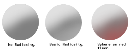
As one other tiny little note, I'm gonna add another pic here. It shows something called Radiosity. This is done using the airbursh tool to show it better.
The first is a normal sphere. But look at the second. It starts light, gets darker, but then gets lighter again. Why?
Because light bounces. It's the same reason that the shadow of a tree in a field isn't pitch black. It's illuminated by all the light that's bouncing off everything else. The same principle applies here. On occasion (usually in static pictures) an object will have this light-dark-light principle applied.
In the third example, the light being reflected back onto the sphere is red. Why? Because the floor is red, so the light it reflects back is also red.
Radiosity is less important, and used very very infrequently in 2d game art I find. But it's worth being aware of it. I believe it was used to good effect in Eternal Daughter's sumptuous title screen (but don't quote me on that).
Tiles
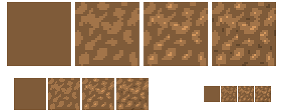
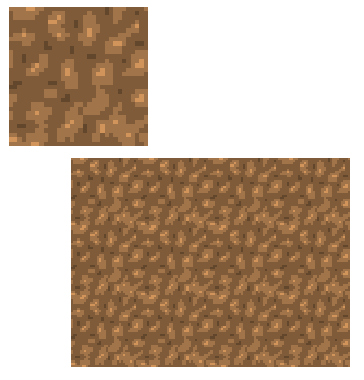
This should be quite a short section. We're going to focus on using Graphics Gale to make a seamless tile.
This image shows the various steps. The smaller images are different zoom levels of the same steps:
To start with, we fill the tile area with a darkish colour. We want a soil tile, so we'll choose a medium-dark brown.
Next, we select a lighter shade and start pointing out clumps. We don't worry about making the image wrap seamlessly yet. Also, don't be very precise. Just blob in some blobby squiggles.
We then insert a few highlights (maybe less than I have done here)
Finally, a few darker bits in the space between the light and medium parts.
I personally use this concept of three tones in virtually every tile I do - grass, water, rock, sand, anything.
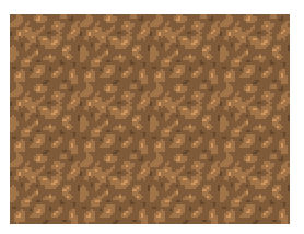
At the moment, tiling it produces this:
It's better than I expected, but we can improve it.
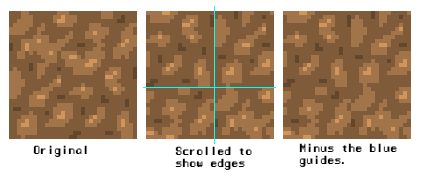
In Graphics Gale, we scroll the image on the X and Y axis so the pixels that used to be on the edges are now centralised.
In the 2nd image, I've drawn blue guides to show where the edges have now been moved to. Hopefully this will show you how scrolling works in Graphics Gale. It simply wraps the image around itself. The 3rd image is the same, minus the guides.
All we do is a bit of cleanup work, making it tile a little better:
Voila! A few subtle touches and it tiles nicely. You can use this feature of Gale to make sure that virtually any tile is seamless.
Colours
Yep, there's more. An important key to creating a graphical style is using a colour scheme.
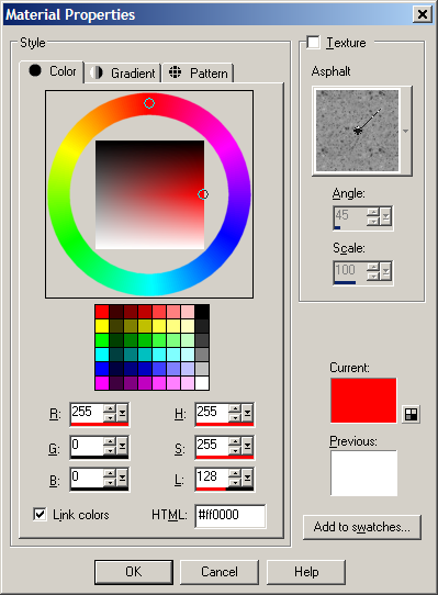
We're going to introduce you to the wonderful world of HSL.
HSL stands for:
Hue Saturation Lightness
Normally, people tend to choose colours by setting a value for the Red, Green and Blue channels (we'll refer to that technique as RGB). HSL works differently.
Using HSL, you set the Hue, Saturation and Lightness values instead. The paint app will take these values you give it and return an RGB colour based on them. Let's run through what each of these parameters actually means, using this screenshot from PSPX for reference:
- HUE -
Look at the priddy colourful wheel. This shows HUE. Hue literally means 'colour'. Changing the Hue will change the actual colour of your paintbrush.
- LIGHTNESS -
We're going to consider lightness before saturation. Lightness is used to lighten or darken a shade of colour. You select the colour using the colour wheel (hue), and then you use the 'lightness' parameter to lighten or darken that colour. A value of 0 will give you total black. A value of 255 will give pure white. A value of 128 is in the middle (as shown in the picture above).
- SATURATION -
Saturation is where HSL comes into its own. Lightness determines how LIGHT the colour is, but Saturation determines how BRIGHT a colour is. There's an enormous difference. If you desaturate a colour, it gets closer and closer to grey. If you saturate it, it becomes bolder, more vivid.
Desaturating your palette is used to give you earthy, more natural looking colours. For example, if we're looking for a soil colour, we select an orange-red hue, desaturate it a bit so it's less vivid, then darken it. This is what I did when selecting the colours for the looping soil tile above.
EFFECTS - Using HSL for different properties...
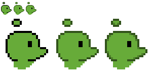
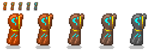
The way you choose a colour can give an image different properties/style. In this example, we're going to try selecting some colours for this little sprite. He's a little invisible dude who wears a cloak that gives him special powers. If he ditches the cloak, he's invisible, but obviously loses those cool powers (so he has stealth on his side, but can't attack). The cloak has some patches that glow on it and a gold trim. It's a platform game, and he's facing right.
The first image is totally saturated. The SAT channel is 255 for every colour in that image. It looks kind of bright and cartoony doesn't it? It's exciting, it's vivid. If there was any doubt before, hopefully now you know what I meant about the difference between lightness and brightness. This is bright, even where the colours are quite dark.
What we've done with the next few images is progressively desaturate them. The final one is totally desaturated (it's greyscaled). However, we've kept the trim of the cloak and the blue bits the same.
First, notice how the saturation totally changes the style. Where image #1 looks cartoony, they steadily get more serious-looking. Colours in something like Sonic The Hedgehog are very saturated (vivid) whereas something like Castlevania uses very desaturated tones (dull, earthy). It reflects the game type.
Secondly, since the rest of the cloak is less vivid, it creates a greater contrast between it and the gold/blue bits.
If I were using this guy in a game, I'd probably use the centre image, or possibly the one just left of it. Having everything else a little desaturated means I can use saturation to make other stuff seem brighter/stand out more. It gives things a unique power that would be lost if the whole thing had the same Sat levels. Does that make sense?
Hopefully, the pictures make more sense than the words, LOL!
Depending on the kind of style you want, your choice of saturation will be different.
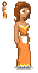
Stance/Perspective in Platformers
That little bit above just reminded me of another brief section we can look at. It mainly applies to platform games.
In my cloaked example above, I've fallen into a classic trap. I've drawn the character absolutely from the side. That's not normally a good idea. You can get a lot more from your character and sprites by tilting them to an angle so you see a bit of their face/front.
Let's have another example:
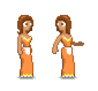
This is Betty. Notice how she's slightly facing us? Some better examples of stance for platform games can be found at:
There are two basic ways that I use to animate:
Frame-by-Frame, where each frame is copied and altered a little more. I do this for basic animations, such as breathing.
Keyframing, explained below.
There are some important terms to learn here, which come straight from the animating world. If you've ever used Macromedia Flash, they'll explain where some phrases and expressions that it uses come from.
Keying Inbetweening or simply Tweening
Keying is the foundation of the whole animation. You basically draw out the main, or key frames. In a punching animation these may simply be the guy standing still and the guy with his fist extended.
Inbetweening is where you or someone else draws out the frames that fill out the space between the keyframes. In animation, this was normally done (before the days of computers) by a very underpaid member of the team that no one really liked.
In the case of most of us, however, we have to do both!
There's a reason that Keying, followed by Tweening, is a good order for animating. It gets you away from this idea that frames have to be alike.
If you animate by moving one little bit at a time, you'll find that you've basically got the same image throughout the whole animation. Just with different bits of it moving around. It looks rigid, undynamic.
You find this at times in walk cycles, where the player's limbs move but his head stays in the same position. You know that the artist just went through each frame moving limbs.
Keying first encourages you to break free - to make each stage of the animation very different from the others.
It also enables you to get good results quickly. Once you've done the keying process, you can animate them and have a look at the sequence. Have you ever had the experience where you've spent hours animating something, only to press play and think: Hang on... that's rubbish!
Keying will enable you to see the basic finished animation in half the time. Once you've decided you like it, you can then spend the time Tweening it (smoothing it out by creating in-between frames).
So with that in mind, let's go back to Betty again.
Let's have a simple animation where she looks over her shoulder, then returns again. The reason I've chosen this example is that it forces us to alter the shape of her upper body and arms. We're not gonna be tempted to just move limbs around. This requires some basic redrawing.
Personally, I don't totally redraw the sprite. I drag enough bits of the frame around to remind me where everything has to go, then start drawing over it to fix the shape (this is what I meant by *basic* redrawing. We're not gonna try reinventing a perfectly good sprite for every frame, just making alterations to shape and angle).
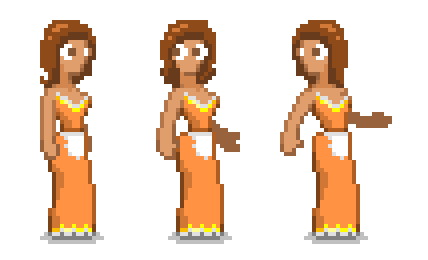
Here are our first keyframes:
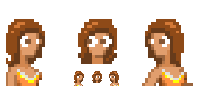
Now, between these two frames, her arms need to move, her shoulders need to twist, and crucially, her face must turn to look at us. We can't have it appearing to snap around suddenly, lol. To help with the face, I'm gonna copy both heads into PSP and see if i can use them as references for drawing a third, centralised head.
Here's the result:
Now if we try making our first in-between frame, we draw something like this:
Personally, since that's still a huge shift, I'd consider that to be another keyframe rather than a tween. But anyway, now we have our three basic stages to the animation, we can start smoothing it out by tweening these keyframes. It's interesting to note that MMF2's editor has an Onion Skinning option (as I mentioned in the 'Tools' bit I believe). It fades the frames before and the frames afterwards into the background, so you can use them as a guide when tweening.
Apparently Graphics Gale can do this too, but it seems not to do it in the Free Version.
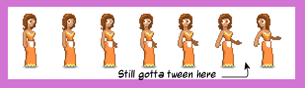
This is it so far. The arrow and note show where I've not yet tweened. I've been doing this simply by choosing a frame that I think could be turned into the tween I want (usually the frame immediately before or after), making a copy of it, and then altering that copy.
See that gap I've left in the tweening? The tweens that I'm gonna put here are going to need to be twisting her head around. I *could* redraw this, taking ages. But look at some of the earlier frames. I've already done a little head tilting in those frames, so I may as well just copy those heads onto my new tweens and blend them a little so they fit. It saves a lot of time!!
Having done that, we're presented with the finished animation. GIFerised courtesy of Microsoft GIF Animator (that's free too, it seems).
(You may find this animation goes stupidly fast in Firefox)
In Conclusion...
This article hasn't covered anywhere near as many areas as I would have hoped, but maybe it'll help someone.
The basic keys to the whole thing are:
Think; Use what your mind already has. Your eye is used to seeing shading and colour and all sorts of things, so look at your work and think 'does this look right?' What's more, try to look a little more carefully at things in real life. As time goes by, you'll find yourself wondering how you could achieve that same effect with pixels.
Practice; You'll develop skills if you practice. Your mind will get used to thinking about how to express different things using pixels. For example, when you see water, you see a distorting flowing pattern of shading over a constant background. So when making a water tile, you simply have two layers - one is a background, the other is a semitransparent water foreground. Scroll the foreground, altering which bits glisten and glint in the sun, and slightly distorting the base layer.
Your mind will honestly get used to that if you practice.
It's not that difficult, the point is that it's important. Gameplay makes a game what it is, but you can't make a screenshot of gameplay. You need to get the user playing the game before they'll realise how cool it is.
Reasonable graphics show that someone's taken time over the game. It shows the game's loved, not some old hag we bodged together in minutes.
err.. sure
"There is absolutely NO excuse to make an ugly game.
NONE whatsoever."
thats not true. the fact that it takes ages to draw everything perfectly like that and who gives a crap anyway nobody is going to spend $20 on a click game so dont bother dressing it up.
Rocketron: There's no excuse to make an UGLY game.
No one mentioned anything about creating perfect graphics; some people just don't take any care whatever about the look of their game, and that's unforgivable.
That little cloaked guy took less than 10 minutes to make. The soil tile took roughly the same, maybe less.
Sometimes, it's just a case of choosing the right font for the title screen. SOMETHING to show that you care about your project. Cos if we get the impression that it isn't a good game, we simply won't download it.
Damn, this is a nice article. I break a lot of the rules it looks like
I mostly do black outlines, but with different in-between shades of colors inside them. Also, your animation is awesome. I usually don't do more than 3 frames for each direction since I don't use a program that has layers to draw on top of the previous frame (I should REALLY get one soon). This makes animation really difficult for me in general. I have Photoshop 7 but hardly ever use any effects aside from blur.
I've tried hand drawing pictures and scanning them into the computer to make sprites, but it's a huge pain in the ass to do all that cleaning up, bit by bit. (Where even a black line is a lot of different shades of grey when viewed from close up.) Any tips on how to get the computer to clean up black lines from scanned images DeadmanDines?
I'm not sure about cleaning up lines. Out of curiosity, try this:
Load your scanned pic in PS7, then copy it and paste it as a new image. Change the copy to monochrome (just 2 colours, absolute black and absolute white).
Copy your B/W version and paste it as a layer over the original. Set its Filter Effect to 'Multiply'.
The monochroming process will give you some jagged lines, so you'll unfortunately need to clean them up manually. But if you do it this way, you always have the original underneath to use as a reference.
But some of us still don't have that Math problem solved even using a calculator, pencil and paper, an abbacus, ruler, and anything else you can think of ... by the End of the Day.
For people like me, it'd take at least a week an' a half. Comment edited by MBK on 2/21/2008
I can't draw well even when I get paid to do it and I know most of the tricks in this article, but hey, it's a great article . 5 stars. I like the HSL trick, but I doubt I could draw that cloaked guy in even 1 hour
This was a very good article, especially that part on animation. That part made me think about the sprites I'm working on now. How much smoother it would be, if I used the tweening method. I will properly redraw all of the sprites! But that is ok, it will at the same time give me experience in pixel drawing.

 Advertisement


 (wooyay)

 Paint Shop Pro X - £44 from Amazon.


 I had my very firdt game look ugly. I hope the seguel doesn't.


 . 5 stars. I like the HSL trick, but I doubt I could draw that cloaked guy in even 1 hour