Im going to be making a bunch more tutorials on specific things such as tiles, metal, trees So if you want me to create a tutorial on anything from trash cans to ¾ view RPG characters just DC mail me and Ill make it!
Ive noticed a lot of bad pixel art on this site. Ive hardly ever download any games anymore because of poor graphic quality. Its like the graphics were an after thought Bad mistake, you need to think about what your graphics are going to look like and spend some time on them. You could be the crazy goodest coder on this site but if youre graphics look terrible then youll still screwed.
You need to practice if you want to get better. I did, and in a couple of months my skills had increased %200. I now am going to give a few tips on what I have learned over the past couple of years.
1.Shading:
What I see a lot of is pillow shading. This is an example of pillow shading. DONT DO THIS or I will track you down and cut off your clicking finger with this rusty tin can lid.
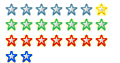
Here's an example
In this the spriter shaded all edges and did not pick a light source. Its just plain ugly and it leaves the viewer confused and repulsed. It looks as it the light is coming directly form the front like your eyes are the sunlight shinning on the sprite. This is unrealistic and as a result looks sloppy and unprofessional. You must pick a light source. In this article I will be using the top left corner.
In order avoid pillow shading you need to pick a light source. I usually choose the top left corner. What this means is the sun is shining down on the sprite from the top left and then creating the shadow on the lower right edges of the sprite. The light source will always cast the shadow or shade on the opposite side of the light source. Always use your chosen source and dont be switching in the middle of the sprite.
Dithering
Dithering is a technique were you use a checkerboard pattern of pixels to blend colors together. If used correctly this can cut down on your color count and look quite slick.
Right here folks, only two colors blended to create a cool effect. It almost looks like your on a beach or something. Now, how does this look on a real sprite
Look right there. Pretty cool huh. Dithering can be used to make things look more natural and it just makes things look cool.
This is a log before and after. Dithering can add a lot to a sprite so start doing it!
Contrast
Many times people try to use lots of colors and smoothly transition between light and dark. DONT DO THIS. Have you ever seen a shadow from something and saw it smoothly transition from dark to light? No, the light is suddenly cut off drawing a fine line between dark and light. When choosing a color palate choose about three colors of a certain shade. Light, medium, dark if you feel you need more try to use dithering to transition.
Heres the million-color transition combined with pillow shading. Look at the second tree. Its vastly better, just from those few techniques. See how theres only two colors in the top of the tree? It looks a lot better than the first and it has a ton of less colors. DONT USE TO MANY COLORS.
Anti Aliasing
This technique is another way to blend things and make them looks smoother without using tones of corny colors. The process is that you put light edges on the sharp edges of a black pixel out line. It creates a smoother look.
See how it looks smoother when the sharp black edge is soften by the lighter shades? Of course you do.
2.Outlines
The main thing to making a good sprite is the outline. The outline is like the foundation of a house. If youve got a bad house foundation your house stinks if youve go a bad outline youre sprite stinks.
Basic things to consider, dont plaster the sprites arms and legs together in a stick looking thing. Heres an example.
The guy looks fake. Its ugly. In real life you dont stand like that.
Imagine your guy is angled toward the screen and you can see some of his front. So when hes walking its like eventually he would come out of the screen. Also, get his arms out from his side and spread his feet apart some.
See, all these guys are angled toward the screen and their arms and legs are spread apart and I must say, therere lookin good.
3.Highlighting
Highlighting is one of the last things you do on a sprite. Its basically the opposite of shading. Shading is where you darken were the light doesnt shine and highlighting is adding a glimmer where the light shines the brightest on a sprite.
See that little round circle of white? Thats a highlight and it makes the sprite look like its really metal.
Highlighting can be useful in creating cool hair as well.
You see that little ring of lighter color around the front of the sprites heads? Thats were the lights striking it the most and in turn creates the highlight.
There are some good highlights in these sprites as well. Can you spot them? You just put the lighter shade on the opposite spot of the darker shade.
Conclusion.
Anyways, I hoped this helped in some small way. If you want to get better I would suggest studying other peoples art to learn how to use different techniques and such.
Some more help on the actual techniques would be nice, rather than just a showcase of your work (however good it is). For instance, how do we dither? Just put the pixels in randomly?
Yeah, I did read the article Hishnak. I'm just saying it would be improved by informing us what colours and stuff to checkerboard and the edges of dark/light.
If you're planning on doing a lot of these articles you might want to become a teacher and run a course over at <A HREF="http://www.klikacademy.com.">www.klikacademy.com.</A>
It's not always good to make your character face 3/4's all the time in the "side" animations. For instance, in 4+ direction animation RPG's, I think it's better to actually have the character's profile.
Thanks alspal, at least someone found it usefull...and Alonso, I'm not sure what your talking about but, in the article I was mainly refering to platform characters.
Ahhh, I see what your saying...you think I tried to make myself look better by showing bad stuff beside it? If so, thats just lame, you should probably show more respect of people than that...but anyways, I don't want this to turn into a flame ware so here's a friendly smile
I think you guys are being very harsh to be completely honest.. The article basically goes through the steps of telling you techniques on creating sprites - I don't think it was written specifically to tell you how to create a sprite, just how to improve it.
Very useful article in my opinion - I think everyone else should shut up
"Fine, we won't ever post any constructive criticism from now on"
My comments wern't aimed at you - your comment was fine. Just stuff like this which I find a bit harsh:
"the 'before and after dithering' log is stupid. You claim it's just before and after you dithered the pictures, but the first is just a pillow-shaded rectangle. You're making things seem worse than they are to make your techniques seem more necessary. It's cheating and it's rude. Be more HONEST!"
That's because he's added detail to it - you need to remove pixels from the sides of the log and add shadow to it in order to make it look more realistic. Maybe he should have said that, but I can definately see how the first log was turned into the second one with some adjustments.
LOL, awesome! So far in Captain of the Guard 2 (which I have made greatly improved graphics for) I have broken just about every one of your above "do nots". Let's hope people will still like it for what it is!
I know all about light sources and etc, but I also used pillow talk or whatever in places and I think it looks good. Different variations of the same color? Yep! And the stand still profile? Check! To be fair,it's only one frame of a much better looking animation IMO, but yeah when he stands still he's not in 3/4 view. Your sprites look great, but they just kinda' look like your basic SNES style sprites you see everywhere. Mine may not be technically correct but at least they're all mine.
Oh, and I tried the anti-alaising bit to see what would happen, and all it did was slow everything down to a C R A W L . . .
This isn't a complete DIY guide to pixel out, but it lays down important pixel art concepts. And it's not too difficult to work out how hishnak has dithered his art if you just look at it up close. To say that hishnak didn't explain the techniques is just bollocks.
I think what phizzy meant about the log is that you could have added some (non dithered) detail to the first log, Because otherwise you can't really compare the two.
It's by someone called Tsugumo, and it is by far the best pixel art "tutorial" out there. It covers just about everything you need, from the most basic ideas to more advanced techniques which you don't seem to employ let alone describe (such as selective outlining), and including both scenery and character sprites.
When an article is posted in the hope of helping someone, telling them things like it's no good, and that your work is better, is not advised. That's not constructive criticism, that's being a douche.

 Advertisement


 .gif" BORDER=0>